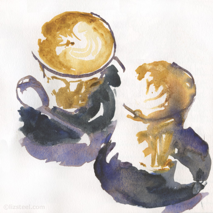
I am flat out today crossing off items on my last minute “Edges SD Launch” action list so this is a quick post comparing a few coffee sketches.
Starting with the two that I did last week, where I started doing some interesting stuff.
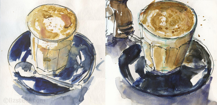
And the first two from my local cafe when I started my regularly visits in October last year. This was before the staff realised I was sketching each day. They now make a special effort to create coffee art for me! So sweet!
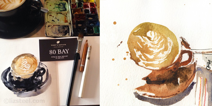
Here are two more from last year when I tried to order lattes in cups – I find a cup and saucer are much easier to sketch than a glass and saucer.
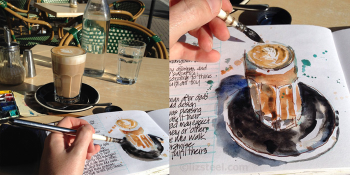
A latte in the sun from Launceston, also from last year… hmm, was 2015 the year I started drinking more coffee?
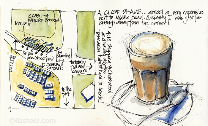
And just for a bit of fun… going back into the archives from 2008 when I first started sketching! Oh! look at those lines… they look a bit ‘hairy’ but I think they are in fact more ‘re-stated thinking’ lines.
Because I am too busy to write anymore, I will let you do the analysis and comparison. Looking forward to hearing any of your thoughts!

8 Comments
I actually like the “hairy” lines on the bottom sketch. They are interesting to look at (at least to me!)
thanks Sherre!
Liz, you inspired me with all your morning lattes to do an illustration for the flyer for a program at my library. Take a look:
http://theslipcover.blogspot.com/2016/04/book-cafe-reborn.html
very cool – thanks for sharing Melissa!
I like the lost edges on the newer lattes. Very cool.
Yes thanks Kirsty – I do too!
Loving the one a the very top of this post: it really pushes me to visually fill in what you just suggest.
thanks Suhita – I am very happy with that one too. I am focusing so much on the coffee art that I am not being a loose and free as I normally am. But the top image I was distracted and need to try that again
NEWSLETTER
Subscribe for first notification of workshop + online classes and more.