
And the winner is…. (drumroll please)….
Version B!
Before I start my wrap-up of the results here are a few general comments:
– First: a huge thank you to everyone that commented. I had nearly 150 responses over the various social media platforms. In the days ‘likes’ rather than ‘comments’ it was great to see more comments than likes on facebook at one stage. Thank you too for the comments on why you liked a certain sketch.
– Secondly, these four sketches do not represent an even comparison as the last two didn’t include sky and the composition of each is different. In a way, I like the fact that they are all so varied and that each one is doing something different – so the comparison is not just between the media being used.
– I enjoyed reading your choices for my favourite one, and the ‘whys’. I smiled when a number of people said that they thought I liked a certain sketch BECAUSE it was the fastest! Yes, I do work fast, my natural pace is fast but the funny thing is that I would like to slow down – truly I would – it just doesn’t happen that way! What I am most interested in is the flow of my work regardless of the pace – how good or how easy or how enjoyable it felt at the time. My favourite was C and I think that my flow for this sketch was in fact the slowest (even though B might have taken a little longer). I also love risk taking and C wins in that department by a long way!
Anyway, to get on with the results
B – 40%
A – 32%
C – 20%
D – 8%
This is the order I was expecting although I must admit that I was surprised at how popular A was. At one stage I even thought A was going to win.
My preference in order is … C, D/B then A. There is not much difference in between D and B but A is definitely my least preferred. I just looked through all 4 originals in my sketchbook again… and they all have merit!
So a few more comments on each version:
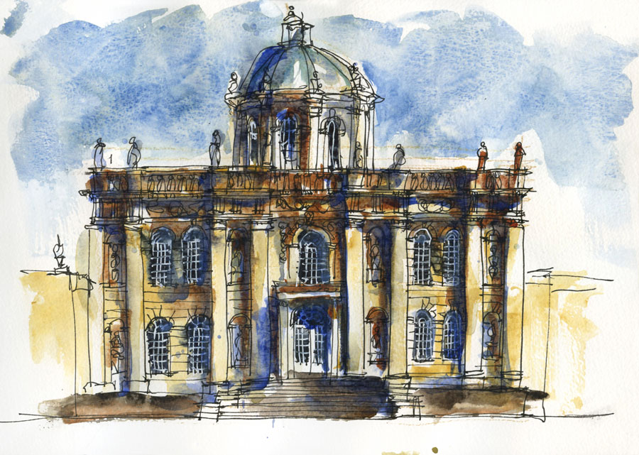
A.
This one scored highly because of the strong contrast, the loose lines and the context. As this was the first sketch in the series that I did, it does have the most liveliness and is the one that records my first impression of the building. The fact that I didn’t allow enough room for the dome proves that my focus was really the facade – the front of the building and not the dome. This facade is highly significant in English Architecture and I was thinking about that while I was drawing it.
Whilst the strong contrast in this version caught a lot of people’s eye, I wasn’t very happy with it at the time – it was too dense, too top heavy in relation to the soft light of the photo references that I was working with. This is a great example of the difference between what you were trying to capture at the time and the end result which is viewed independently of the real thing.
A lot of people liked the sketches with the sky… this sky is not as good as version B … it was late at night and I was tired.
A number of people commented that this one was preferred because it showed more context. As this sketch is more an architectural study of the facade, context was not something that was particularly high on my agenda… if it was, then I think that D has the most potential as it includes more space to indicate the foreground lawn.
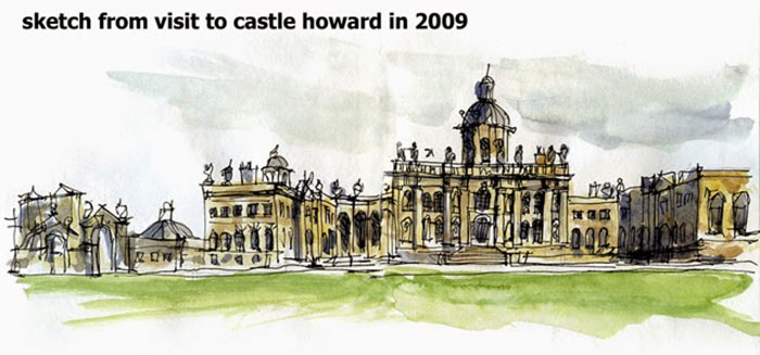
BTW this is the sketch I did at the time on location at Castle Howard in 2009… I would have needed a much larger sheet of paper to record the full context!
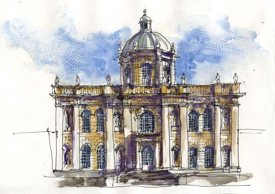
B.
The most popular because of the composition, the amount of detail, the colour etc. Overall this sketch best describes the building and was the most measured of all the versions. I found it very tame to do it at the time – very much like my architectural illustration work – and if I hadn’t broken the sketch up into a number of sittings during the day, would have been quite bored by it. I could have done this version even more carefully… one day I will shock you all with a careful on-location sketch.
After having sketched the first version, I knew how to place the facade on the page so, to allow more room for the dome and the sky was more carefully laid in it. And I used purple shadows rather than blue for a softer and ‘prettier’ look.
I am not at all surprised that this one came on top, and despite finding it a little dull to sketch, I knew at the time that it would work out well. I felt in control at all times.
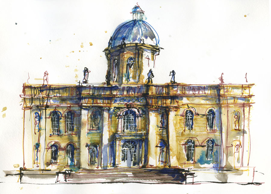
C.
Most people guessed correctly that this was my favourite… and it is not because it was the fastest (as I was working the slowest for this one) or simply because I was using coloured inks. Having a selective focus and playing with lost and found edges is a better reason why it is my favourite… but basically, it’s my favourite because it was the most fun to do.
This sketch is all about the central part of the main facade and how it related to the dome… the side bays of the facade are less important and it is VERY interesting that I distorted those in a very asymmetrical way in response to the light – a sign of the artist triumphing over the architect?
I am toying with the idea of adding sky to this but at the time, I stopped when the ‘flow’ of my work stopped and that didn’t include the sky in this version.
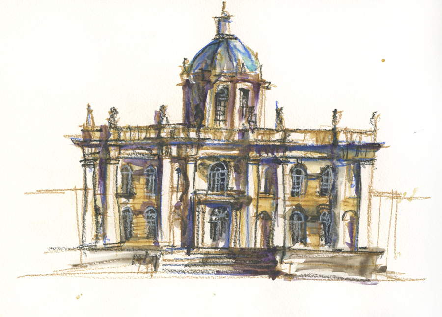
D.
I was expecting D to be the least popular – it does suffer from being compared with the crispness of the ink and wash versions. There is a lot that I like about this sketch as I proved to me that I can tackle a very complex scene in under 15 minutes and get a result that expresses the whole.
If I only had 15 minutes at Castle Howard to do a sketch, I would much prefer this version than an over-rushed, half-completed attempt at version A – something that I have done many times on location.
This sketch was done with rapidity and energy that created quite a buzz – I was going completely crazy and I think that watercolour pencils are good for this.
There is more that I could say, but this is already long enough.
I think the biggest ‘takeaways’ from this exercise are:
– every sketch you do is valid and tells a different story
– when you sketch spontaneously without planning, there will be things that could have been done better
– doing a number of different versions of the one image is a lot of fun, but you have to make sure that you have a different emphasis each time to make sure that you are not bored.
Thanks again to everyone that commented – it was SO much fun!
Subscribe to my mailing list for my monthly newsletters including first notification of my new SketchingNow Online Sketching Courses and face-to-face workshops.

4 Comments
Thanks for posting results, Liz. I was curious!
I loved this survey, Liz, and for a variety of personal reasons. Maybe the most important is that even people as experienced as you still wonder about their 'style.' I seem to oscillate between a desire to be more painterly and a desire to depict accurately.
One thing that's interesting to me is that I didn't even notice that some of the choices had no sky. My eyes see stuff but my brain doesn't always "see" 🙂 Have you, by chance, seen this YouTube video on that subject? It's amazing.
https://www.youtube.com/watch?v=qpPYdMs97eE
Anyways, thanks so much for putting these choices before us and causing us to think about such things. — Larry
my pleasure!
thanks for that link Larry – amazing!
Interesting that you mention – wonder about their 'style.' – I wasn't really thinking about style at all when I was doing this. I have a number of different ways of working that I employ in difference situations but I think my style crosses all of the versions.
I am not happy with everything I do (I am not sure there is an artist that is like that!) but am very interested in how my satisfaction with the end result can be quite different from my experience at the time.
I can certainly relate to your oscillating… there is a part of me that would like to be able to do careful rendered work on location but I know that I would get too physically uncomfortable to do so…and besides in the main, I want to be able to capture more, more easily!
BTW these comparisons were more about me testing my theories about what my readers liked than my own preference – hee hee!
Thanks for the great comment!
NEWSLETTER
Subscribe for first notification of workshop + online classes and more.