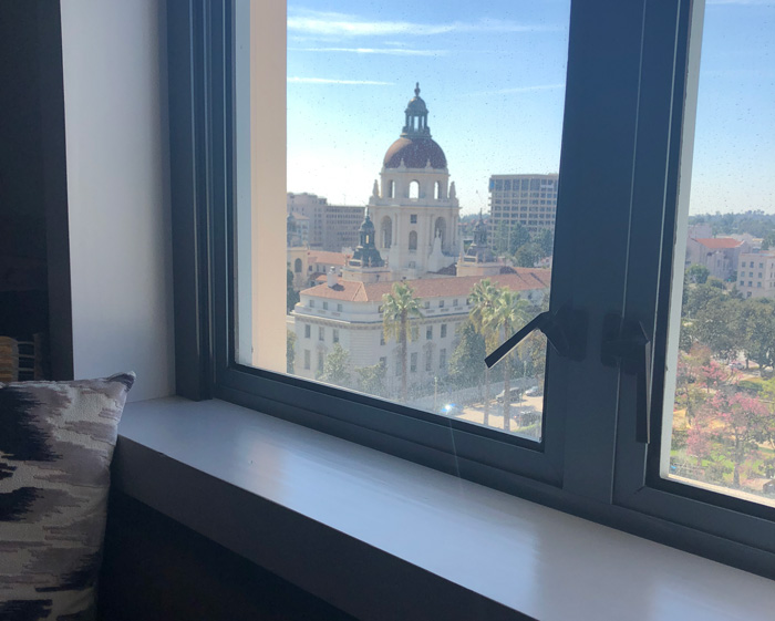
If you have been following my Californian adventures over the last few weeks, you will already know that I got slightly obsessed sketching the gorgeous Pasadena City Hall. I managed to sketch it 16 times during my 13 day stay – which has to be a record even for me. Having a great view from my hotel room was a major factor in achieving so many sketches.
It was designed by Bakewell and Brown and completed in 1929. Wikipedia says that it has elements of both Mediterranean Revival Style and Spanish Colonial Revival Style. But when I was sketching the dome I was always thinking about the architectural precedents of a dome sitting above one or more cylindrical drums – namely St Peter’s in Rome and St Paul’s in London. (To compare here are some links to my sketches: St Peter’s and St Paul’s.)
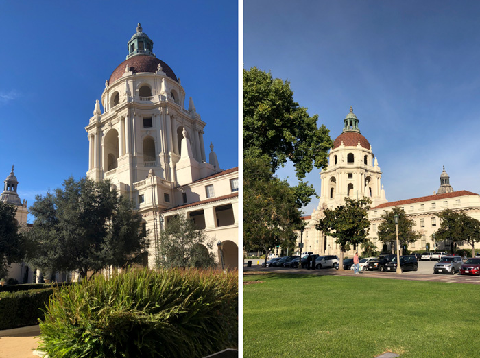
The really interesting thing about this building is that there were many different aspects to it – all of them very sketchable. There is the dome, the main pavilion and entrance way, a courtyard and surrounding buildings with corner pavilions.
But I don’t want to get distracted by an architectural discussion (although that would be really fun!) and instead I just simply want to share my collection.
So here are all my City Hall sketches:
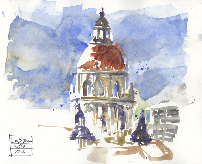
#1 Wednesday from my room in the Westin
First (direct watercolour) sketch as soon as I arrived, trying to capture the main volumes and the shadow shapes.
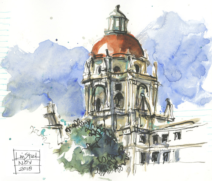
#2 Thursday morning from the courtyard: first sketch
My frenzied sketch (click here to find out why I call it that). This one was almost a fully ‘reflex sketch’ – ie. it just appeared on the page.
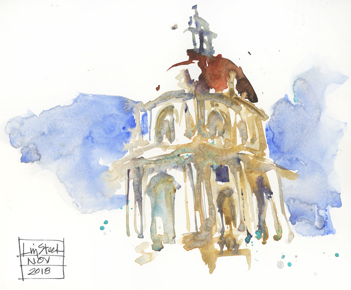
#3 Thursday morning from the courtyard: second sketch
Immediately after I finished my frenzied sketch I was in the mood to have another go – this time in direct watercolour. It came out a lot better and was one of my favorites.
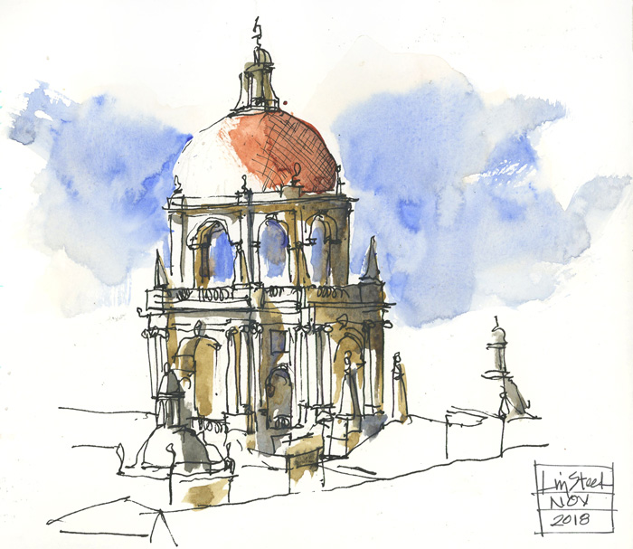
#4 Friday morning from my room in The Westin
This was done early morning, before breakfast on the first day of Sketchkon. I decided to do this using a traditional ink and wash approach, drawing with lines first and then applying watercolour. This enabled me to separate the volumes and architectural details from the colour. You will note that I only really applied colour to the shadow shapes. One of the challenges of painting this building was how complex the shadow shapes were!
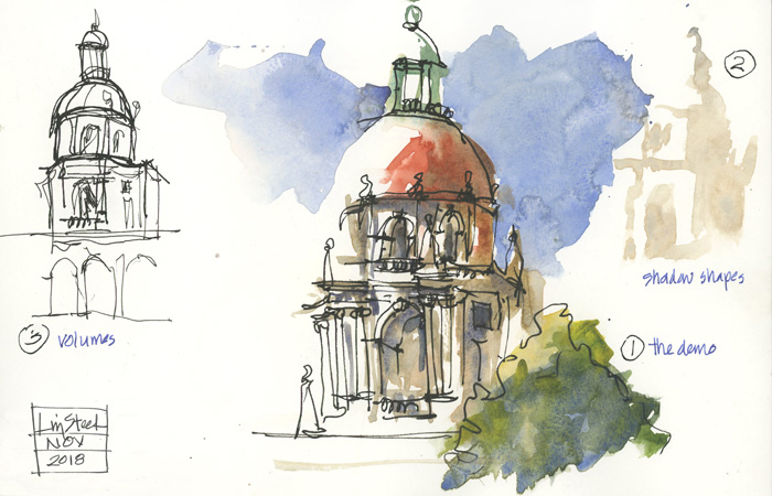
Saturday morning during the Sketchkon sketchcrawl which I led.
#5 (centre) A quick demo sketch applying paint first then line
#6 (right) A quick diagram of the shadow shapes
#7 (left) Another quick diagram showing how I sketch the main volumes first and then the architectural details
During the sketchcrawl I did a quick demo showing a small group how I sketch ‘paint first.’ The two smaller sketches on the side explain the two steps. When I was painting this building in ‘paint only’ – with no line – I had to combine the two steps.
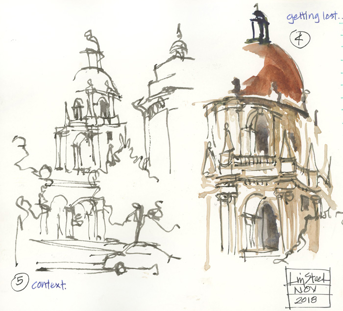
#8 (right) Another version during the sketchcrawl alternating between line and colour
#9 (left) A quick drawing to include the colonnade to the courtyard so that I finally grounded the building
The sketchcrawl was only 1 hour and despite talking a lot, I managed to do another two versions.
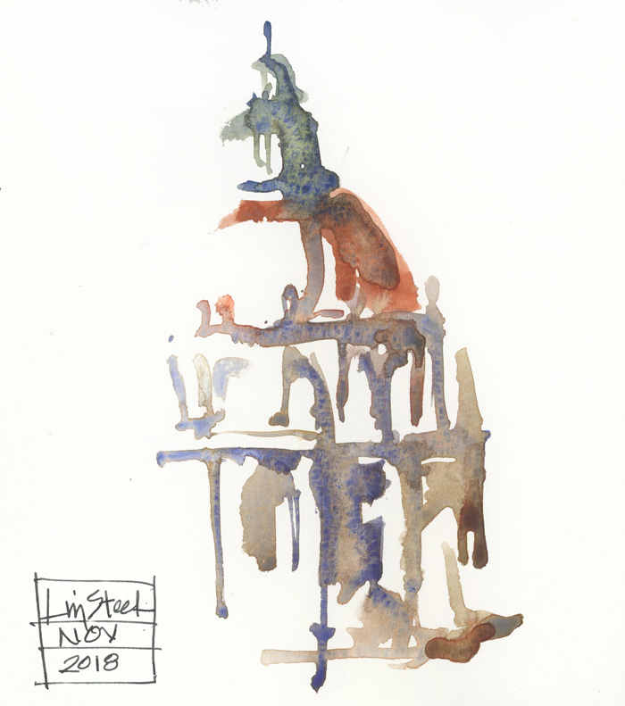
#10 Monday morning just before I checked out of my room in The Westin
So I had to do another version before I changed hotels, didn’t I?
I wanted to do a loose almost abstract sketch but my washes in this one were a little too wet and I lost the strong shadow shapes so I stopped early. I didn’t quite achieve what I wanted but had time to have another go.
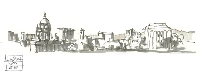
#11 Monday morning just before I checked out of my room in The Westin
But before I did that, I decided to do a small context sketch of the entire view from my window. Tone was added with an Ecoline marker. This sketch helped me to think more clearly about the shadow areas.

#12 Monday morning just before I checked out of my room in The Westin – Take 3
And then I tackled the dome again. This time I established a cleared shadow shape with a light wash first, and was more controlled with the pigment:water ratio of my washes.
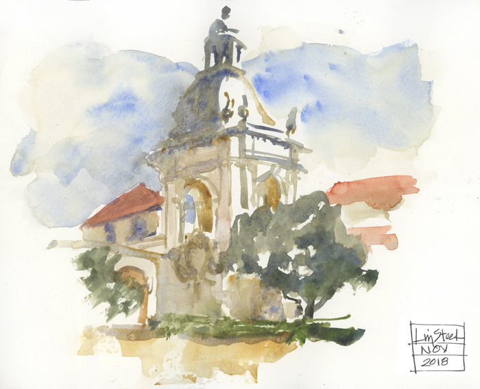
#13 Thursday afternoon sketch inside the courtyard – Sketch 1
Phoebe, Debbie and I returned to Pasadena after sketching in the downtown. We wanted to sketch the main facade which was still in sun but there were a few guys hanging around playing very loud horrible music. So we had to retreat inside the courtyard. This corner pavilion was the only part of the complex that was still receiving any direct sunlight which we could see from inside the courtyard. Another direct watercolour sketch!
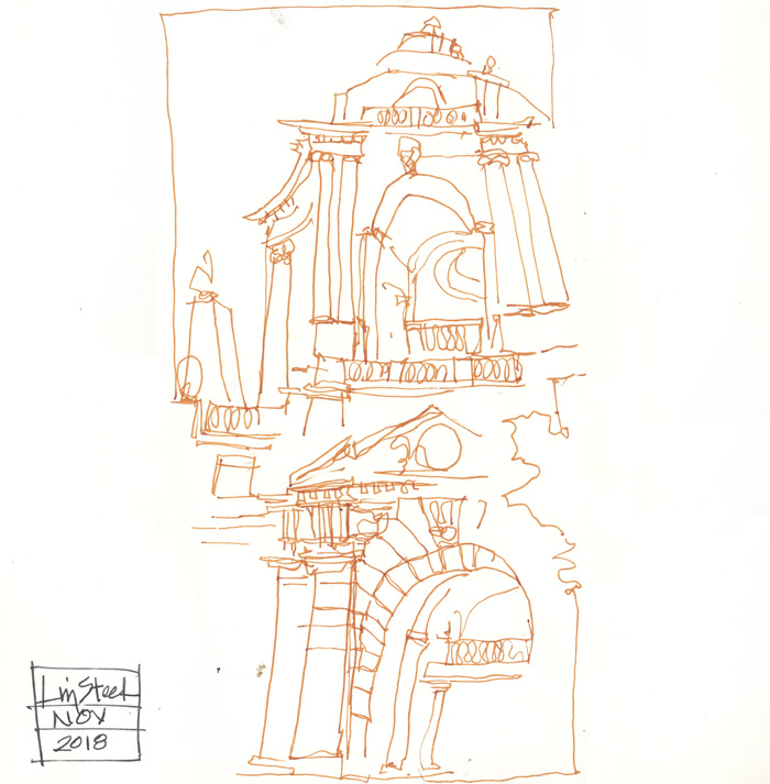
#14 Thursday afternoon sketch – Sketch 2
While waiting for my sketch (#13) to dry to add one final wash, I did this fun (mostly) continuous line version of the dome and the central pavilion.
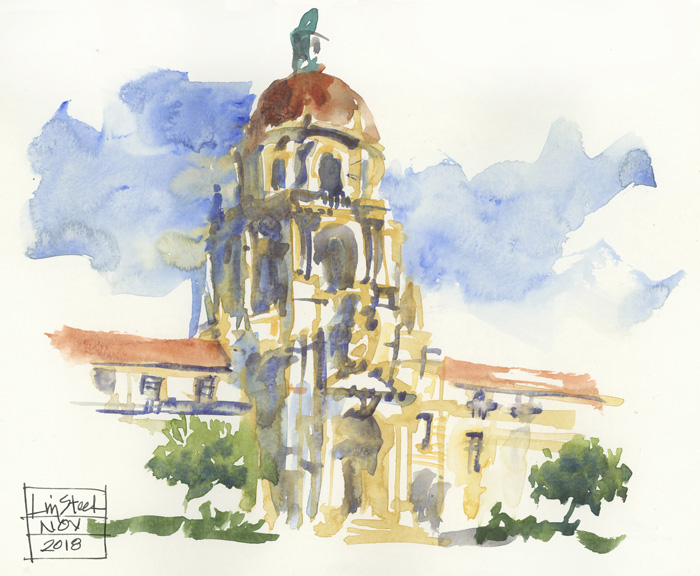
#15 Last afternoon around 3pm – Sketch 1
I was very thankful that the loud music players were not around, so that I could finally sketch the main facade in the glorious afternoon sun. I did this sketch (another direct watercolour) using WN Naples Yellow for the wall colour.
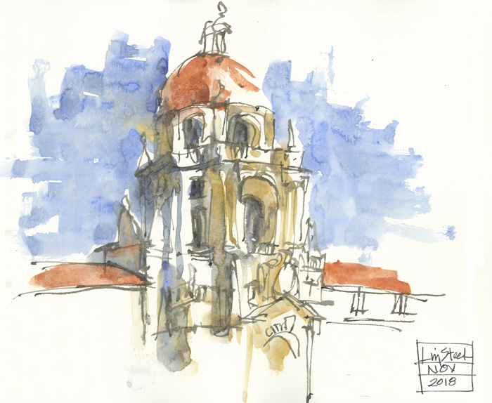
#16 Last afternoon around 3pm – Sketch 2
And then I couldn’t resist doing one final quick sketch of the dome mixing line and colour.
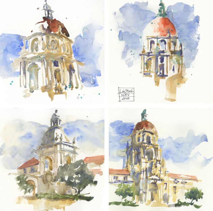
So there you have it. Although there is a lot of repetition in this collection, I hope that you picked up a few little tips (especially if you have done Sketchingnow Watercolour and/or Buildings, so that you know the way I think.)
I don’t have a single favourite version but these four are my pick. I find it interesting that these are all direct watercolour sketches.
Do you have a favourite from this collection?


17 Comments
I like #1, #10 and #12 best. The very loo se waterpolo risa wonderful.
Stupid autocorrect “loose watercolor”
I like #2 best – the frenzy sketch! It has so much life and the thicker line in the vegetation really works. Maybe the occasional frenzy is a good thing? Thanks for sharing, you are keeping company with the greats by repeatedly portraying the same thing – thinking Monet here!
I like the morning sun versions of City Hall better than the afternoon views – #12 is my favorite. But I also like the afternoon view of the pavilion (#13) — great examples of light and shadow. I live in Pasadena and see the silhouetted view more often than the morning sun-lit view!
Love hearing your preference Corinne! 🙂
Thanks Jane. I’m ok with frenzy 🙂
I enjoy seeing variations on the same subject so this post is most interesting to me. I loved the continuous line sketch more than some of the others but also detected many examples of continuous line in at least two others. How often do you use that technique? Great post Liz and thanks. Frank B
Hi Frank – yes I use continuous line quite a lot – if I only have a short time to sketch I will often use it for a simple line drawing (such as in this case) but just generally I will do a lot of short continuous lines within a sketch. Well spotted.
Amazing to see the different versions and how you approached them. Great post!
thanks Joan – I thought at the time that a number of them were very similar but when you put them together they are all different.
Hi Liz,
your skies are so beautiful? What color do you use other than blue (cobalt or cerulean) to create that beautiful effect?
I’ve been enjoying your posts so much!!
Antonella
Thanks Antonella – I don’t think that I mixed anything much with WN Cobalt Blue in any of these skies but maybe it’s just my dirty water that is creating the magic (I normally do my skies last… or towards the end of my sketch)
That is really interesting! thank you, Liz.
I never knew there were so many different ways to sketch an item. I am learning quite a bit through your blog. My favorite is #2.
thanks Carolyn – this is only scratching the surface… doing a 100 versions would be fun!
I love your work.
I’m too serious.
In this series your sense of play is great.
Thanks Graeme – I fell in love with this building!
NEWSLETTER
Subscribe for first notification of workshop + online classes and more.