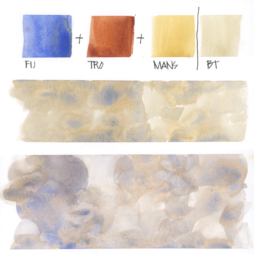
I regularly get asked about the light beige/ cream washes that I use for many of my building sketches and whether I’m using Buff Titanium (by Daniel Smith).
Even though I love Buff I rarely use it in mixes because
- it’s so opaque and can easily make washes murky
- I normally prefer a more lively result.
And so I generally create my own Buff mix using three favourite colours in my palette:
FU – French Ultramarine (Schmincke)
TRO – Transparent Red Oxide (Daniel Smith)
MANS – Monte Amiata Natural Sienna (Daniel Smith)
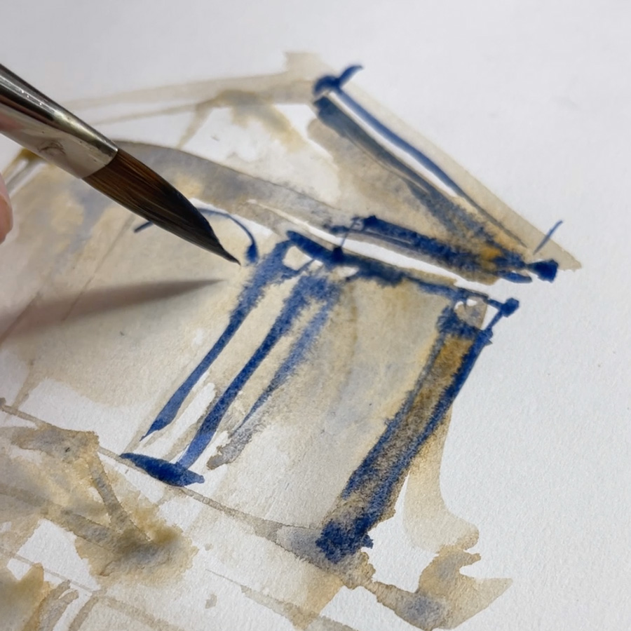
These three colours create wonderful lively washes – what I call ‘pigment parties’ – on my page. To create this I use a good amount of pigment and plenty of water!
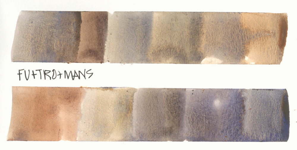
I also use this three-colour combo for more juicy washes – varying the proportion of each colour and adjusting the pigment-to-water ratio.
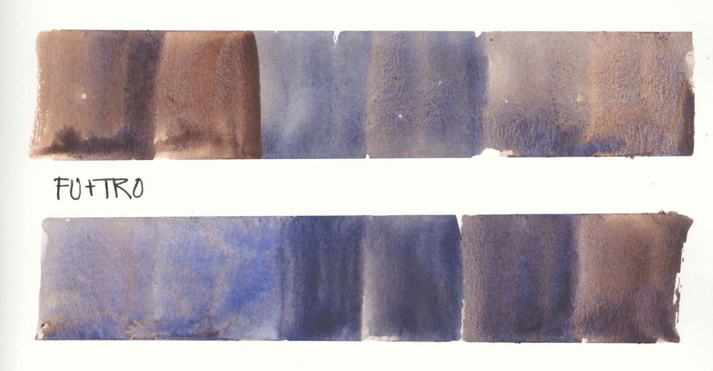
French Ultramarine and Transparent Red Oxide mixed without MANS is also a favourite combo when doing watercolour sketches of buildings.
It’s amazing how much variation you can create with these three colours!
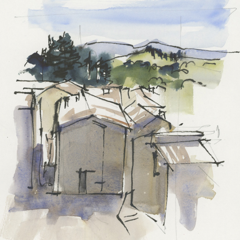
Here is an example of using these mixes (from Foundations – live demo from Lesson 10)
And another example that clearly shows the pigment parties in action mid-sketch! See more photos of this sketch here.
BTW all these examples are done on Stillman & Birn Alpha paper – so imagine how much more watercolour magic you can achieve using true watercolour paper!
Putting this blog article together today is making me think two thoughts:
1. I so rarely use Buff that maybe I should try removing it from my palette. I’ve done this in the past and survived so maybe it would be good to try this again. When I have done this before I swapped it out with Lavender.
2. How important it is to be able to consistently create watercolour washes with the right amount of pigment and water. Many sketchers tell me that they struggle with this when sketching with watercolour (especially when out on location). So this is a big emphasis in my Watercolour course which we will be going through again soon – starting on 15 March. Find out more details here.
I intend to create some watercolour-themed articles in the coming weeks so would love to know if there is anything specific you would like me to discuss. Please let me know in the comment section below.
(If you are reading this via email, please click on the article title link below and add a comment on my blog. Thanks!)




39 Comments
Thanks for the tip!
My pleasure Judi!
Hi Liz!
Thank you for yet another informative and cheery email! I can’t wait to try out this combination of colours and see the results.
Happy sketching!!
Marilyn
My pleasure Marilyn – hope you enjoy this mix!
I agree Buff does tend to flatten the color and is too opaque. Will try your color mixtures.
Have fun – hope it works for you Mary Lynn!
Thank you Liz! What color “ Lavender” do you use?
Hi Karen – its the DS one – I know it has white in it, but its a fun colour!
So interesting. I’d like to hear more about the use of French Ultramarine Blue vs garden variety Ultramarine.
Hi Susanne – check out this article 🙂
https://www.lizsteel.com/ultramarine-comparisons/
Thanks, Liz. Buff looks so useful, a quick fix, doesn’t it? But it’s very opaque, and dead in comparison to the mixes you show. Even if you mix it with other colours for a spot of opaque it still looks miserable! Go for the lavender! I’ve just discovered W&N Ultra violet, a great mixer and darkened.
Yes Patricia – its easy for Buff to make washes flat if not used with enough water. And yes, the lavender swap is happening soon!
When do you mix the colors on your palette, when do you mix them on the paper, and when do you wet the paper first? So many variables, I need a decision matrix!!
Thanks for your question Marianne – its certainly something we discuss inside Watercolour but I’ll keep an eye on what I’m doing in the next few weeks and mention in a blog post.
Is there a comparable color to the the MANS sienna? I’ve got to try this combo to see how you use dark colors to make a light one. What fun!
Hi Kelly – try whatever earth yellow you have – yellow ochre or raw sienna – and it might work well. I’ve not found a nicer earth yellow than MANS to date – it just has a beautiful glow!
Hi Liz, Greetings from NYC.
I’m curious about your approach to the value scale, especially when doing these kinds of mixes. Is it just a squinting of the eyes or a constant re-working ? Thanks for all you do for all of us.
Hi Bill, thanks for your question. I’m hoping to mention values in an article next week… so stay tuned.
Great I’m looking forward to that. I’m also wondering about how to display colour mixes for future reference. the colour grids I do are leaving me more confused, or I feel like there’s more to discover and I’m not seeing the information properly when I just paint a set of squares.
Hi Kimbi – little mixing squares don’t do it for me either. I do larger swatches and mixing strips. See here
https://www.lizsteel.com/six-colour-palette-mixing/
I’ll give this trio a try. I currently play with light yellow ochre, French UM Blue and Permanent Alizarin Crimsom or Permanent rose. I find this combo good for buildings but also for flesh colour.
Hi Liz – that sounds like a good combo and would mix some lovely and useful hues! I should try a similar combo from my palette (MANS, FU and QR) – I have used it in the past but not regularly so thanks for reminding me
Really helpful, Liz- thanks! I love the color of buff titanium but i don’t like that heavy opacity! Looks like I need to purchase a couple new paints to make your mix! : )
Glad it was helpful Charles – I suggest you try the colours you already have (yellow earth, orange/red earth and ultramarine) first!!! 🙂
Great advice…thanks for sharing your magic.
My pleasure Nancy!
Awesome article Liz and it came at a perfect time. I’m trying to rework my palette and keep going back and forth about removing Buff Titanium. I rarely use it but when I need it (like for a beach scene) I need it. I didn’t think it would be possible to mix something so close but you did it. BT is getting the boot!
Do you think your mix would work with Burnt Sienna in place of TRO? I do have TRO repoured into half pans that I was going to sell because I already have Burnt Sienna on my palette and felt having both was redundant. But if this mix is TRO or bust I guess I’ll keep it.
Hi Lity – it’s totally worth trying your current combo of yellow earth, red earth and ultramarine. It might not produce the same amount of pigment party (TRO and the SHC FU are the reasons my mix is so special) but you still should be able to mix a more lively version of a buff wash.
Liz…….enjoy your helpfull Colour talk! How about green? From. Margo. B.
Hi Margo – more about green here
https://www.lizsteel.com/removingsapgreen/
and here
https://www.lizsteel.com/tag/green-pigments/
enjoy!
Liz, I’d love to see an article comparing the triads (yellow, red, blue) you use to create different atmospheres – overcast/rainy, full sun, etc. Like Lity, I’m trying to rework my palette and minimize pigments. Thank you so much for all you share in your blogs, and for the fabulous international community you have created and nurture in your Sketching Now courses. I’m looking forward to another Watercolour course!!
Hi Peggy,
Great question. Triads are a great way of limiting hues and creating harmonious paintings. However…
I don’t typically use triads as although they are great for colour harmony they don’t give me enough options in regard to pigment characteristics (something I discuss further inside the course.) This is just a personal preference related to my initiative use of colour and desire for texture and lots of pigment parties.
So I capture different light by recroding the values, hues and intensity as I see it using or modifying the colours in my master palette (Lesson 3)
Hi Liz 😀
I hope it’s not a trade secret, and I do intend to take your watercolor course in the future, but I was wondering if you might share the ratio/proportion to achieve a consistent buff? I’ve got pages filled with experimenting, and while I *do* get lucky sometimes and get a perfect buff, in those moments it never has a pigment party!
Yes! I’ve not been happy with BF so glad to hear it’s switched out. Curious about DS Lavender and how you use it.
Hi Michelle – I’m also curious how I will use it 🙂 See more here
https://www.lizsteel.com/when-to-use-lavender/
I keep using buff titanium, especially for stucco buildings, but it does always seem to dry flat. Maybe I need to practice with this mix!
My biggest question about watercolor currently is the greens. I cannot seem to get consistent shades. I think of your Lane Cove trees in particular, and I know you worked a lot on how to achieve good background greens, good natural greens, as well as good texture in the focus trees. All of that still mystifies me! Lol!
I found your tag for greens by following your tag for mixing on this article. Thank you for tagging so well! Ha! I think it’ll take me awhile to study all your articles in greens!
Hi Liz , I am an absolute beginner keen to learn, I enjoy and appreciate all the information you share , way beyond me but I shall continue trying .
Cheers liz thank you for the insperation on mixing your own buff titanium but more useful still three colour suggested mix for buildings very useful kindest regards Steve
NEWSLETTER
Subscribe for first notification of workshop + online classes and more.