Thanks to everyone who left a comment on my previous article about the new Aquarius colours whether here on the blog or on Instagram. It was really fun to find out what colours you were interested in.
I plan to work my way through all the colours doing mixing tests and then work out a way to test them in my everyday sketching. I now know that my initial idea of creating a brand new palette wasn’t the right approach. I think that it will be better to choose a few colours at a time to test.
This week I’ve looked more closely at 7 colours but as always when I do colour mixing charts, I know that this is just the beginning. The real test is using the paints on an actual sketch.
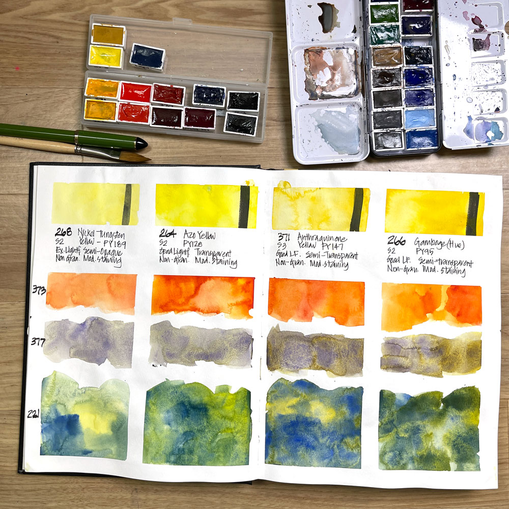
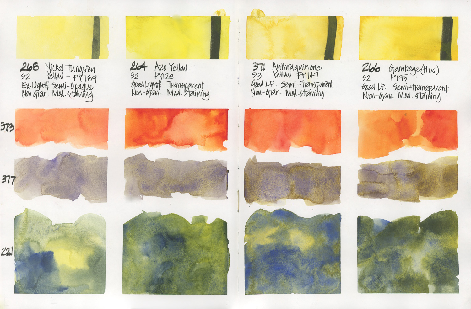
The first 4 colours I swatched were the yellows…
Yellow Pigments
- 268 Nickel Tungsten Yellow – PY189
- 264 Azo Yellow – PY128
- 371 Anthraquinone Yellow – PY147
- 266 Gamboge (Hue) – PY95
In my everyday palette I’ve been very happy with DS Hansa Yellow Medium (see more here) and it’s many years since I did a deep drive into yellow pigments (well, apart from looking at some Quinacridone Gold options in preparation for my Teacups course back in May). So this mixing page was simply a way to get to know each paint colour and to see what happens when creating an orange and a green. I also mixed each yellow with a purple from the new colours (377 Strontium Violet – PV62).
Whilst this page was fun to do it wasn’t enough for me to really understand these paints. As there are already a lot of yellows in the Aquarius range I’m not yet sure what makes these paints different/special in regard to existing colours. But here are a few initial thoughts:
- 268 Nickel Tungsten Yellow – This is a semi-opaque creamy yellow which would be fun to experiment with but wouldn’t ever get a permanent spot in a palette.
- 264 Azo Yellow – It’s really nice to have a transparent yellow!
- 371 Anthraquinone Yellow and 266 Gamboge (Hue) – there is not a lot of difference between these two but at the moment I think I marginally prefer the Gamboge (Hue).
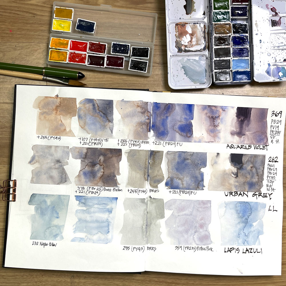
For the second mixing page, I used slightly different mixing formulas for each colour.
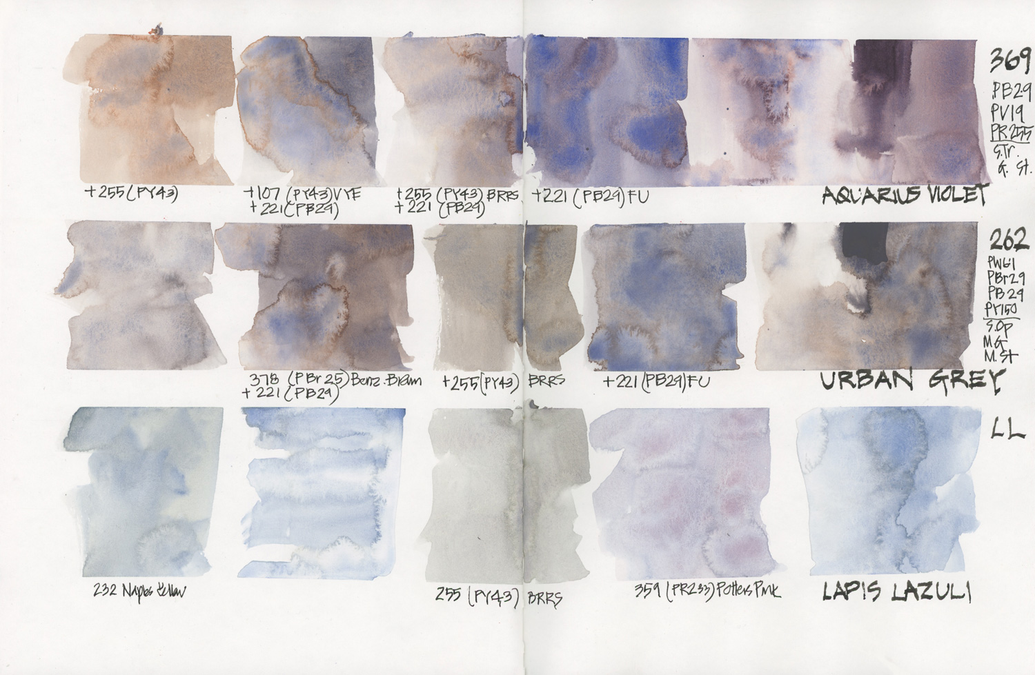
369 Aquarius Violet – PB29/ PV19/ PR255
I think that this was the most requested colour to explore and it was one I was not that interested in. 🙂
Aquarius Violet is similar to Daniel Smith Moonglow (PG 18, PB 29, PR 177) which is a very popular paint but I personally don’t find much use for a muted violet hue and it’s not a favourite colour of mine.
So the first thing I did was to add more PB29 (French Ultramarine) to it so that it was more of a blue-purple. Ah! this is more like it! 🙂
There is no doubt that this three-pigment combo produces lots of wonderful pigment parties!
I then added some yellow earth colours (Blue Ridge Raw Sienna and Venetian Yellow Earth) to see if I could create a neutral grey and a warm grey. These are nice mixes but of course, these swatches were done using 4 different pigments so I would have to be careful how I use them and make sure that there was enough water to prevent muddy washes.
262 Urban Grey – PW6:1/ PBr29/ PB29/ PY150
I followed the same process with Urban Grey. This paint creates lovely washes with lots of pigment parties in a similar way to Aquarius Violet, however the hue is grey rather than violet (obviously!) I’m not crazy about the fact that Urban Grey contains white pigments but it didn’t seem to be an issue in these swatches.
Once again I added a yellow earth (Blue Ridge Raw Sienna) to make a warm grey and also added a brown (378 Benzimidazole Brown – PBr25). Ideally, I would have liked to have added a PBr29 instead of PBr25 so I wasn’t adding another pigment to the mix.
This looks to be the closest commercially available paint colour to my pre-mix Steel’s Grey but I really want to see how it performs in real-life urban sketching sessions.
Lapis Lazuli
This is a gorgeous (and very expensive) pigment but very subtle and it takes a lot of work to get a lively wash. LL makes Potter’s Pink feel like a strong colour!:-)
I honestly don’t know what to do with this pigment – the only use I can think of would be to add it to overcast skies. If you have any ideas – let me know in the comment section below.
Finally here are scans of the mixing pages – click on them to view larger versions.
Doing a single colour chart of each colour is just the beginning. Next up I’ll incorporate some of these colours into my everyday sketching.
So stay tuned for that!

6 Comments
This is very interesting, thanks! I did not know anyone even mined an lapis anymore because it became so expensive to mine and I believe the main source was Afghanistan and who wants to go there now?! I have a polished piece of it from a rock store and it is a lovely color.
I agree with your opinion of Moonglow. I got some years ago after reading raves about it but I also just do not care for the color or the colors it separates into but I know a lot of people do so I passed it on to a friend. Color is so personal. I doubt we all see color exactly the same and there are probably many other variables that go into forming our color preferences. I adore chartreuse but many people don’t. Variety is always interesting so it is great we have our personal color ideas.
Thanks for sharing your explorations into color!!
Hi Pat – yes its good that we are all different and nice to meet someone else who isn’t a raving fan of Moonglow 🙂
Oh that lapis lazuli is beautiful!!
yes it is nice!
Thank you for sharing your review and mixing pages with us. That Lapis Lazuli Afghan is a stunning hue. I skipped buying it on release, but got the Urban Grey which I’m in love with. I know we can mix it, but sometimes it’s just so nice to have it in a pan ready to go!
Color experiments and new paints are always so much fun! For the yellows the Azo is looking great in the scans! I’m not a big fan of Moonglow either. That Aquarius Violet is lovely, but I’d struggle to know when to use it! I am quite curious to see the Urban Grey in action, as it seems very interesting!
NEWSLETTER
Subscribe for first notification of workshop + online classes and more.