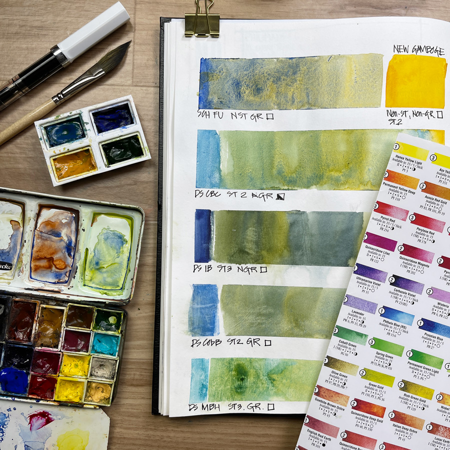
We’ve just wrapped up a special week as part of the Live Version of my Watercolour course. In 2020 I added a special bonus lesson to the course called Pigment Characteristics where I explain how the different properties of individual pigments that make up each watercolour paint colour have a huge impact on the ‘magic’ in your washes. This can be a technical topic, but my goal (as always) is to explain the essentials in a clear, practical and fun way.
Last night during a Live Q&A session I explained how I often do a fair amount of pigment research when I’m asked a specific question inside the classroom. In this case, the question was about two Schmincke colours (each of them had two pigments) and I showed the group how I look up the colour chart, review the properties of the paint colour, and then investigate the individual pigments – often looking up the Handprint site for more details. I can end up going down a rabbit hole at times, but it certainly helps me better understand the nature of the paint colour in question.
However, I totally understand that having an in-depth knowledge of pigments is not everyone’s cup of tea and it’s certainly not needed to create beautiful watercolour paintings. In fact, I sometimes think that pigment obsession can become a bit of a distraction. The temptation to own more and more paints becomes much stronger when you start to get into pigments. The struggle is REAL and I sure know this from experience! 🙂
The most important thing is to get to know the colours in your own palette and know how to use them to create sketches with lively washes!
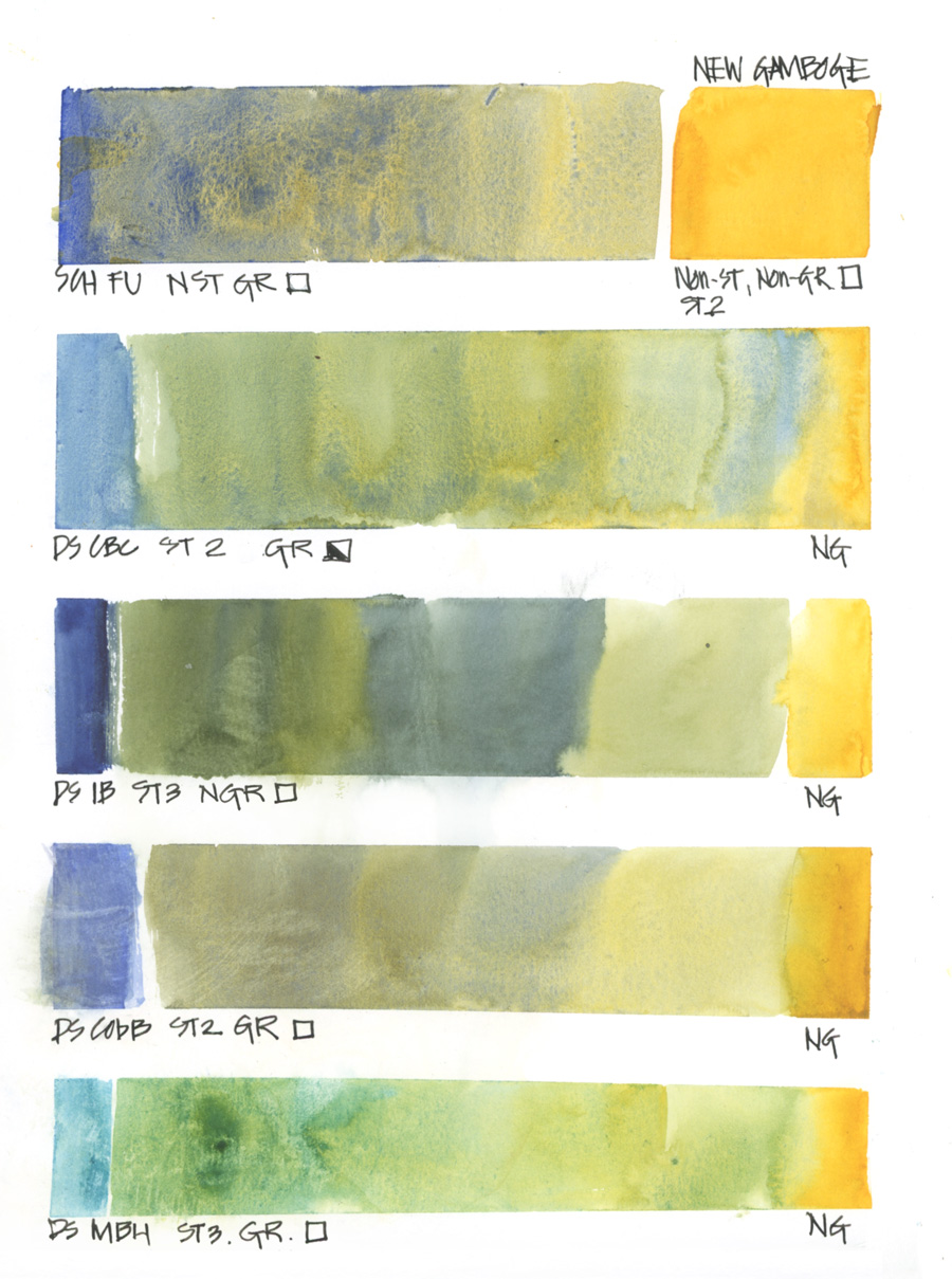
In response to another question asked in the classroom during the week I did this page of mixes with New Gamboge and the blues in my everyday palette.
By varying the amount of pigment and water as I painted these mixing strips I was able to explore the characteristics of the two colours and determine what kind of party each combo created. Understanding how granulating colours vary from staining colours and what happens when you combine them is a good way to start exploring pigment characteristics.
(Abbreviations: FU = SCH French Ultramarine, CBC = DS Cerulean Blue Chromium, IB = DS Indanthrone Blue, CobB = DS Cobalt Blue, MBH = DS Manganese Blue Hue)
And after doing the New Gamboge page I wanted to do some mixing with an opaque paint and a highly staining one. The most opaque yellow in my collection was only semi-opaque (Aquarius Cadium Yellow Deep) and my most staining was a phthalo blue (Winsor Blue – Green Shade).
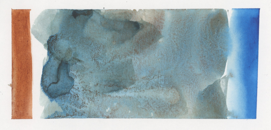
And wow! Look at the crazy result when I mixed Transparent Red Oxide with the Winsor Blue.
I don’t normally see this particular type of party in my work so I had to do another swatch to explore it more.
So in essence… there is no need to learn pigment numbers off by heart (but if you want to do that… I’m cheering you on!) but I do think that understanding pigment properties (transparency, opaqueness, granulation and degree of staining) and how they will affect a wash will help you get better results in your watercolour sketches.




6 Comments
I saw something similar to your last image when I mixed Potter’s Pink and Phthalo Blue–very cool! Don’t know where I’d use it but an intriguing look nonetheless. Loving the class.
Hi Lindsay – yes I would expect it to do the same with other granulating pigments like PP. I’m also not 100% sure what it will look like in a sketch – so will need to test it out.
I share your enthousiasm about that … sometimes I desire to paint with WTC but not necessary to do a great painting, then your research give me a way, a boost to play more with colour simply without any other goal than to know theirs magic effects … It is a great goal by itself … I don’t know why I never give me this permission perhaps because it is not anough complicated to do ? … a brush, water, 2 or more colours, a good paper and go to have fun … I have a cartesian mind, work hard is more value than funny time … i will improve my mind about funny colours time by now … many hours of pleasure, in my too much empty sketchbooks … no stress just try different combinations … just pure funny time … Thanks so much Liz, you can’t know how much you are an inspirating great person!
Hi Lise!
thanks for your comment and yes! there is so much to explore with watercolour – and doing studies/swatches are perfect on days that we don’t know what to sketch, or don’t feel like the pressure of producing a great painting. See you in the classroom!
I had left a comment on your blog a few months ago with a similar flocculation mixing Danial Smith Ultramarine and Winsor Newton Gold Green.
I have stopped using those two brands together. After my ‘problem’, I went back and looked at some of my paintings. I think what I had thought was my poor watercolor skill, especially lumpy looking backgrounds, where I had wanted a soft background, smooth transitions, was these two brands flocculating.
I was surprised at that time, I hadn’t seen more mention of this.
@janeblundellart posted on my Instagram:
I’ve seen this too when mixing some DS and W&N colours many years ago. I think some may be ok as many people have a mix of brands, but I suggest avoiding it.
Thanks for the update Victoria! A love all kinds of pigment parties and rarely want smooth washes/soft gradations I haven’t really noticed any problems with mixing brands… but now I will have to do some dedicated tests to investigate it further.
NEWSLETTER
Subscribe for first notification of workshop + online classes and more.