As I’m having a busy week, I’m going to do a few short posts of some recent sketches…
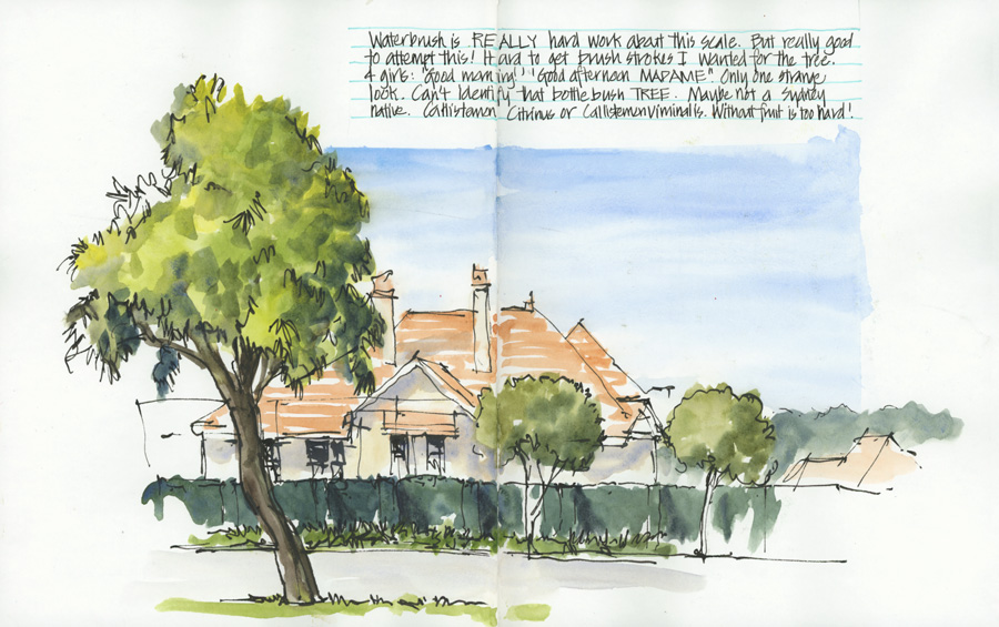
This double-page spread is just a simple everyday sketch I did a few weeks ago which I like.
It’s of a local scene – a street tree and a big East Lindfield house – that was painted with a waterbrush and my Folio ArtToolkit palette. And, it also just so happens that this sketch was for the current Group Run-through of Edges – showing how I modified the amount of detail of the landscaping (both in terms of line and wash) to create depth. (For those of you who are enrolled in Edges – it was done for Lesson 2 Outdoor Exercise)
But the reason for putting this page into its own article is the fact that I’m really pleased with its composition – the position of the tree, the sky shape and the text block. It’s nothing special, but it just feels good.
I’m also pleased with the result considering I was using a water brush. It was hard work to get enough water in my washes and there is practically no ‘pigment party’ in this sketch. But overall the washes are fine! (See here for more about this.)
Not every page in my everyday sketchbook needs to be a masterpiece but I always spend a little time on the design of the layout to create interest and variety.
BTW Sketchbook Design has returned – click here to join us for a Group Run-through starting 4 August 2021.




2 Comments
Wonderful composition. I like the 3 D feel to it. I particularly like the position of the tree and also the sky that is stopped below the top of the tree.
THanks Frannie!!!!
NEWSLETTER
Subscribe for first notification of workshop + online classes and more.