I’m interstate this week for a few days teaching a workshop, so I don’t have time to do the big reveal for my Student vs Artist grade question. (I’m loving all the comments!)
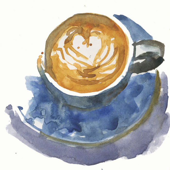
But just as a teaser, here is a sketch I did this week of my morning latte done with WN Cotman (student grade) paints.
Stay tuned for more…

9 Comments
It would be difficult to say this was Cotman compared to artist quality W&N by my eye!
Well, to my eye it’s a bit timid compared to the D.Smith I’m familiar with. Coincidentally, I’m on a campaign, right now, to shift away from the brightest DS toward the earthier & darker ones. Not everyone wants colour that’s like a brass band, playing to impress their mothers in the audience – not _all_ the time. :^>
I agree with Judy’s comment. Hard for my eye to tell the difference.
When she has time, maybe Liz can help us out by painting the exact same cup with her regular palette!
Of course I will!!! That’s totally my plan
On the reveal post, it seems the Cotman chosen for the coffee itself was actually more yellow and intense. The D.S. version looks like it might have a lot of Buff Titanium, with a bit of brown & a yellow or earth yellow blended in. The blues are a little different, but the Cotman isn’t really _weaker_, is it? The D.S. shadow sure is denser, though.
But overall, it seems my comment above – ‘to my eye it’s a bit timid compared to the D.Smith’ was mostly my preconceived idea that student paints must look a bit wishy-washy. :^/
It’s always hard to recreate things in watercolour. I didnt have the Cotman one for reference when I did the DS one, and wasn’t trying to get good intensity (while the cotman one I worked hard to get the colours as intense as possible). The DS coffee is simply just Monte Amiata Natural Sienna and could have been stronger. So they are not a perfect comparison.
I was just trying to prove that although hard work, it is possible to achieve okay results with Cotman… but you have to be experienced. This defeats the purpose of student grade as entry level. But there are a lot of as you say ‘preconcieved’ notions about student grade paint.
Gotcha. Compared to the intense yellow-orange of the Cotman coffee, the MANS looks more neutral, which I guessed to contain Buff Tit’m.
The biggest thing I’m learning here is that my colour perception is relative: relative to context, and relative to my prejudices & preset ideas. :^/
I often watch Holly Exley’s u tube videos on watercolour. She is a professional illustrator and her work is beautiful and vibrant…and she mostly uses Cotman watercolours! I wanted to mention this as they are also very affordable and I’ve used them myself for a long time. I’ve wanted to buy Daniel Smith paints and try some of the irridescents but they are $33.0o a tube! That is a lot! But of course they are wonderful paints. Holly Exley does wonderful work with her Cotmans it’s worth taking a look at her u tube chanel.
NEWSLETTER
Subscribe for first notification of workshop + online classes and more.