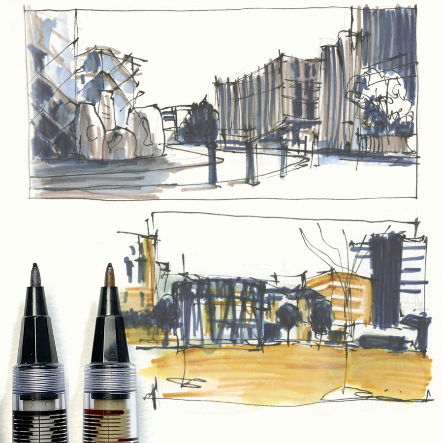
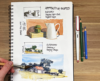
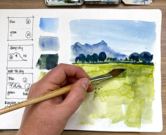
I’m absolutely loving doing 2-colour studies as part of the Lesson 1 exercises from my Watercolour On Location course. I’m actually combining two of the exercises into one – the 3-three value thumbnail exercise with a 2-colour watercolour sketch – and I’ve been getting to explore ways of using the Pilot Brush Pen.
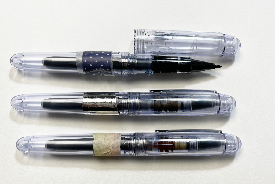
As mentioned a few weeks ago I recently got one of these pens during a visit to Larrypost and then subsequently ordered two more.
It’s a Pilot Brush pen with a felt tip – so in essence a re-fillable marker brush pen. I’m having a hard time finding its exact name but found it on Jetpens as a Spare Sign Pen.
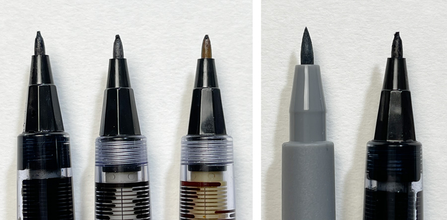
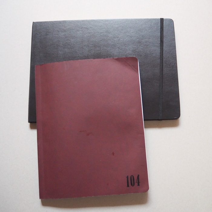
I’m a little worried about how long these tips will last. Here is a close-up photo of my three pens showing the wear and tear to the end of the felt tip and a comparison with a Faber Castell Pitt Artist Pen.
The pen comes with a spare nib and you can also buy them separately… but I don’t want to have to replace them frequently.
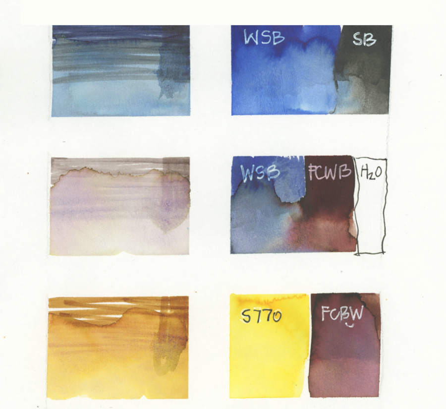
As for the inks that I have in these pens…
I’ve been trying different fountain pen inks – looking for the ones that move the most when I apply a little water. Apart from the yellow ink which I purchased specifically, I’m just using what I already had so this means that they are not necessarily the best selections. But I’m very happy with these mixes.
- Blue pen: Watermans Serenity Blue with a little Sailor Black.
- Grey Pen: Watermans Serenity Blue, Faber Castell Walnut Brown and some water to lighten it
- Yellow Pen: Sailor S770 with a little Faber Castell Walnut Brown.
I’m still experimenting with the best way to use these pens including how much water to add and whether I’m achieving consistent values. But it’s been super fun to limit myself to two colours and three values. And, as we have been discussing within the course, it’s really good to be forced to make some ‘hard’ decisions when sketching!
Here are my 2-colour studies from three different locations…
Barangaroo
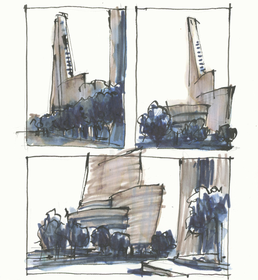
Last week I visited Barangaroo twice. On Monday I walked through the area on the way to Millers Point (see below) and then I went back on Saturday for a short visit. I managed to do five thumbnails/studies in a 1.5 hour period and did lots of exploring. There are lots of interesting views – texture and overlapping shapes – and lots of places to stop for a coffee! 🙂
These first three thumbnails were different views of the one building and the first two were very simple compositions.
Hmm, I’m really liking the subtle variations in colour of the blue and grey ink.
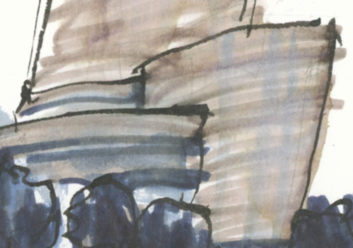
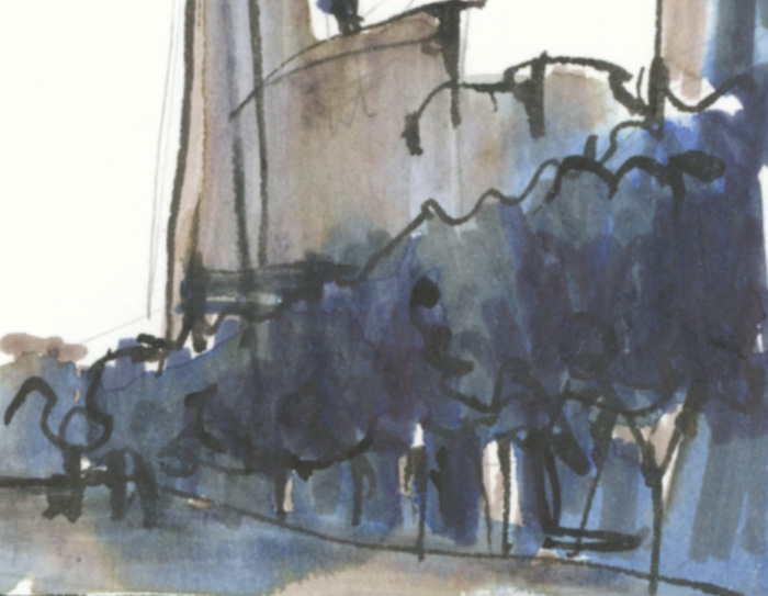
Here is a close-up showing the grey ink variation.
And another close-up of the blue.
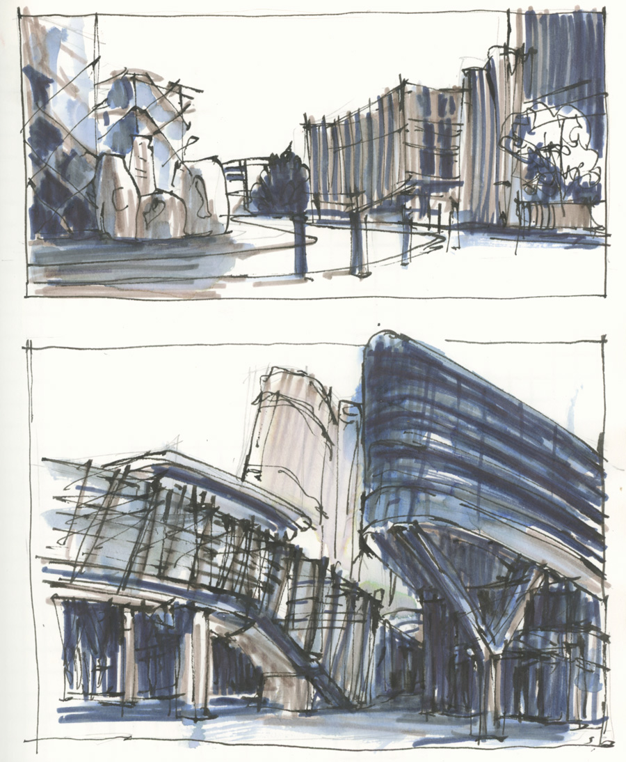
I was then in the mood to tackle some more complex scenes – without any real thought about story or composition. I just really wanted to sketch spontaneously and I then did a review of the result once I was back home.
Millers Point
During my Monday sketch outing I visited Millers Point – I haven’t been here for at least 3.5 years and I was shocked by how much the landscaping has grown. (You can see a photo of this area from 2015 in this article.)
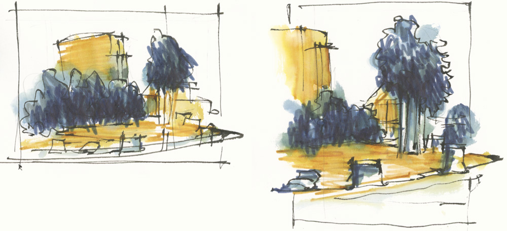
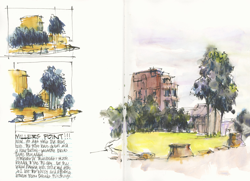
I did two thumbnails to compare a horizontal and a vertical format and to work out how to adjust the values for a very mid-tone scene on a grey day.
I then did a quick loose watercolour version.
Lindfield Village Green
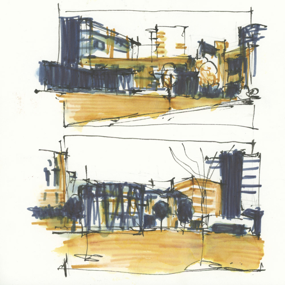
On an overcast day while sipping my usual morning takeaway coffee… I decided to do two thumbnails recording the full Village Green view I was looking at. It was a flat scene so my value choices were all based on local colour.
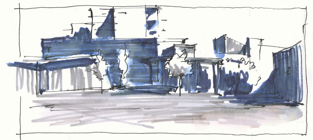
A few days later, on a sunny morning, I did a shadow shape version.
Both of these 2 colour studies have given me ideas for new sketches to do of the Village Green in the future!
Whilst value studies should be done using only one colour (eg. shades of black/grey or a dark colour) I’ve been enjoying using two colours as a challenge and a way to heighten my awareness of values. I’ll be doing some traditional value thumbnails in the next two weeks when we move on to Lesson 2. But if you want to see some value studies before then check out this article.
For those of you doing the Watercolour On Location Live Version, I’ll be talking more about these sketches during our livestream this week.



7 Comments
Hi Liz,
Thank you for this post 🙂
I figured I mention (in case you’re not already aware), but Waterman Serenity Blue is a pretty acidic ink (PH under 3), and Sailor Black, like most Japanese inks, is on the other end of the spectrum, basic/alkaline with a PH around 10,5. While I don’t think that could create weird reactions that would clog your pens or so, that could affect the longevity of the Waterman part (already it’s a pretty fugitive ink) 😉
Oh, and Faber Castell Hazelnut brown should have a PH around 5.
Hi Matt – thanks so much for the feedback. As I mainly use pigmented ink I’ve never really looked into the ph of dye-based inks. As I said in my post, I was just using what I had in my cupboard… no idea where the Watermans came from! I’m only using these inside my sketchbook but will consider other options.
If you want I can send you some ink samples 🙂
Hi Liz,
You can buy replacement nibs for these pens on JetPens. Are you using a converter with this pen? Thank, Cindy
https://www.jetpens.com/Pilot-Spare-Sign-Pen-Tip-Replacement-Pack-of-3/pd/31340
Hi Cindy – oops I meant to mention that in the article. Thanks for reminding me.
And I’m refilling cartridges.
NEWSLETTER
Subscribe for first notification of workshop + online classes and more.