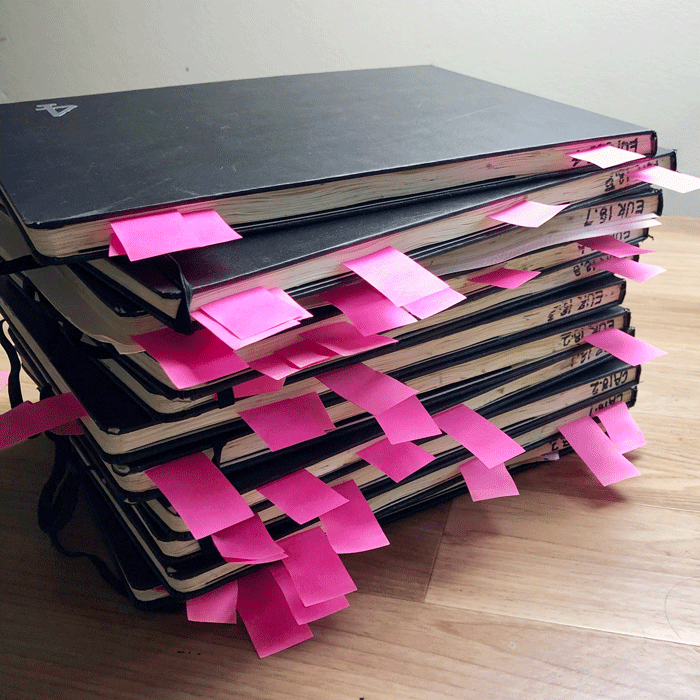
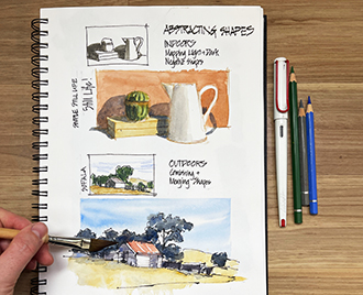
Continuing on with what I did last week, I thought I would review my big travel sketchbooks from 2018 and find some good examples of Abstracting Shapes. This is Lesson 3 of SketchingNow Foundations which we are going through this week in my 2019 Re-run.
I know that I use shapes a LOT in my sketching these days, but it was a little overwhelming to see all the tags I had added for the ‘really good examples.’ So I had to do some serious editing to get this collection down to a manageable number for this article.
Abstracting Shapes is such an incredibly important visual thinking skill to develop when you are sketching on location. When I teach workshops and/or talk to sketchers at sketchmeets, I have noticed that many urban sketchers have never fully grasped this concept, and/or don’t realise its importance. It’s hard to master colour and values if you can’t simplify scenes into big shapes, and getting lost in the details will also occur more often if you are not thinking in terms of shapes.
I also think that starting with shapes is the best way to speed up and/or loosen up your sketching. Whether you add line or just use paint it doesn’t matter – it’s the discipline of abstracting the scene into shapes rather than starting to draw first.
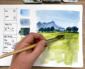
I’m guessing that a lot of you are thinking about Marc Taro Holmes‘ term ‘direct watercolour’ at the moment. And this is indeed what I am talking about – however I use two different terms – ‘starting with paint’ and ‘paint only’. When I start with paint (which represents 90% off my sketching), the first mark on the page is with a brush. I often then switch to line and draw over the first washes, extending the sketch with line before switching back to paint. ‘Paint only’ refers to the occasions where I don’t use any line at all.
But interesting enough, when looking through my books, I realised that some of my paint-only sketches are not good examples of abstracting shapes. This is because I was drawing edges with a paint brush, rather than starting with a shape. By “abstracting shapes” I am referring to a way of seeing (a way of visual thinking) not simply a technique of using paint first. Does that make sense?
Note: If you have enrolled in Foundations, I have shared a bonus video explaining further what I mean by starting with shape, plus a video talking about some shape examples and another one with a bonus demo/exercise. Yes! three bonus videos this week – is that a sign that I’m officially obsessed with shapes? I am really loving re-visiting Foundations and getting into the regular habit of creating videos, so I hope you are enjoying them too and finding the additional material helpful.
As for the sketches: I have grouped them into five different categories and have included some sketches with ink and some in paint only. The important thing is that all of the sketches started with a few painted shapes.
Okay, enough preamble… let’s get going with the sketches.
Architecture
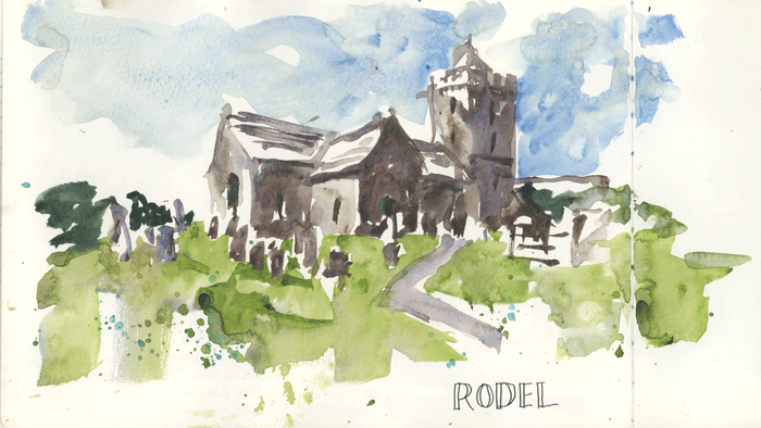
I find it very freeing to sketch buildings in shape – especially those which have big simple volumes.
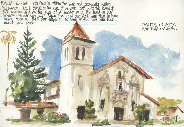
Shape-based sketches seem to cope with a bit of wonkiness better than ink sketches. On this occasion I was talking non-stop to Suhita.

Complicated buildings are easier when you focus on shape even though it feels a little weird not to be drawing all the details.

While other buildings are made to be sketched in shape.
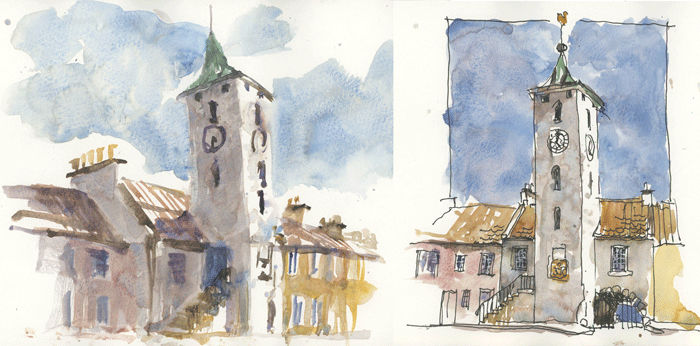
A simple comparison between a shaped-based paint only sketch and a traditional ink then wash approach.

Shape-based sketching can be much faster, especially when you start with the darks. You can zoom in and do a detail, or zoom out and do a big scene. Both approaches work.
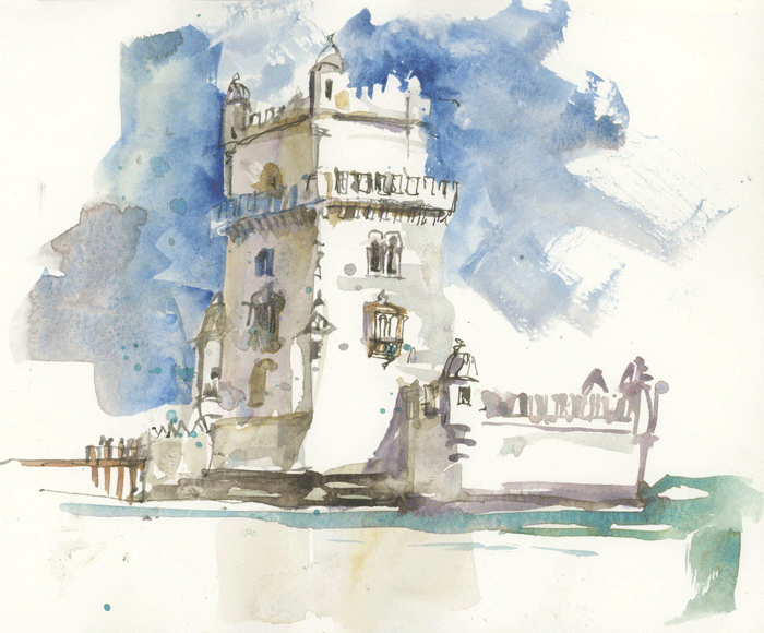
Abstracting shapes – especially when you start switching to painting negative shapes – will produce more expressive sketches.
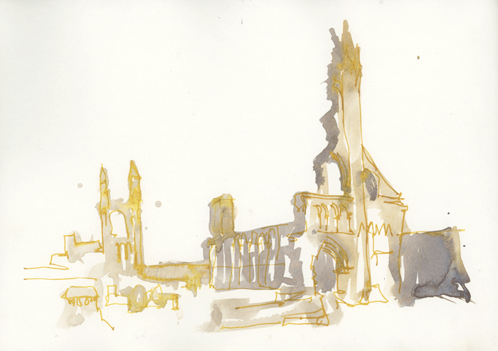
As will, extreme simplification of shapes.
Landscapes
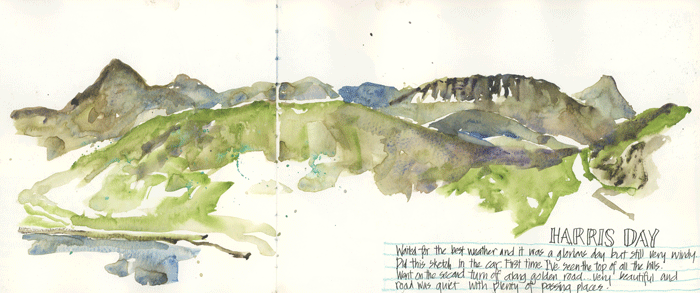
I think landscapes are the most natural subject matter to paint with just shapes. Whether they are big two page spreads…
(Sadly due to the limitations of a blog post it is hard to adequately share the impact of the double page spreads in A4 landscape Moleskines – they look small here, but are big in real life.)

Working with shapes enables me to work very quickly and loosely which is especially helpful when I am with family and/or it is blowing a gale.
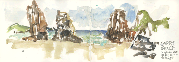
I’m including this sketch because it is an example of drawing with a brush, rather than thinking about shapes.
(For people during the Foundations Re-Run: There is more about this in the second bonus video.)
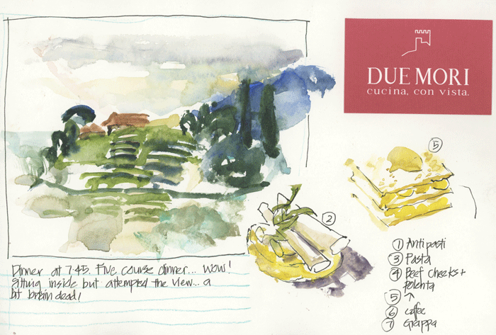
And just like with architecture, it gives me a little more flexibility when I am super tired – when I want to sketch but don’t have the energy to do a ‘proper’ one.
This sketch leads me onto the next theme…
Food
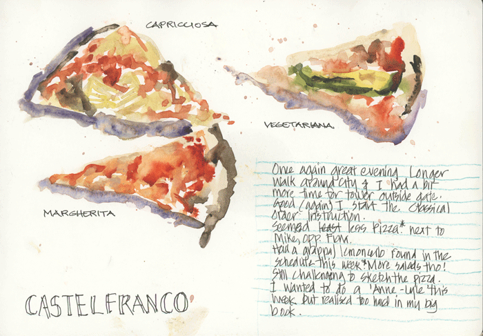
Food is great to do shaped-based. There is a lot of risk when you need to use lots of different colours – but that’s why it’s so much fun.
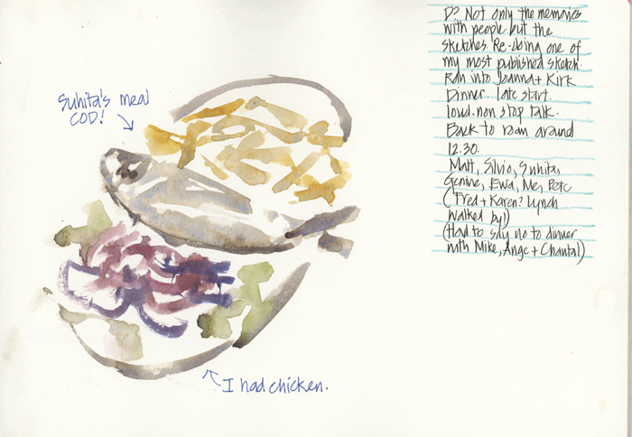
I’m often amazed at how quick and easy it can be.
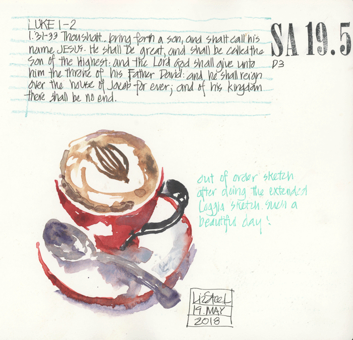
And oh! I have to include a coffee too!
People
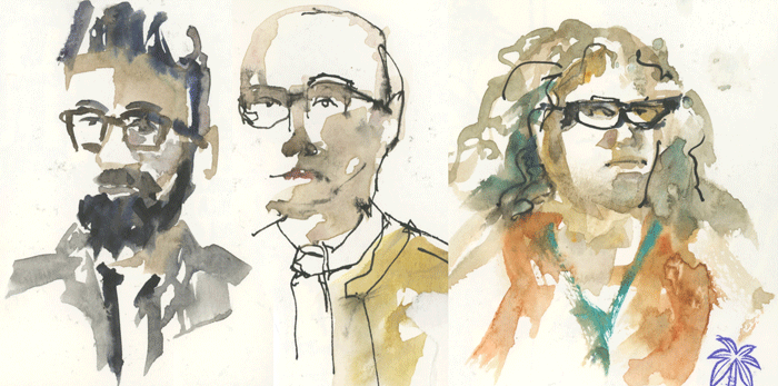
I really started to find sketching people more fun when I started working with shape. Painting shadow shapes first is great especially when you have strong side lighting…
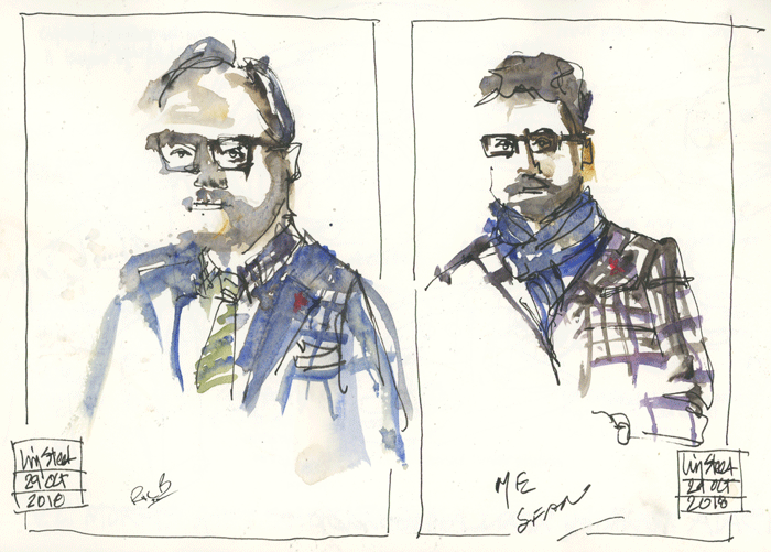
or you are feeling a little under pressure as you can lift the paint, or correct with line. (See here for why I was under pressure on this occasion)
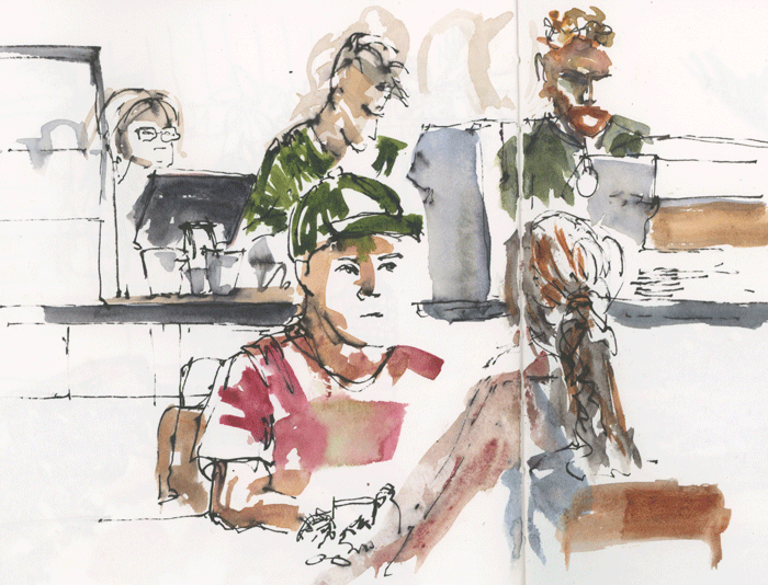
Even though I might do some quick outlines in paint for size/position, I mainly start my people sketches with a big shape – such as the guy with the green cap.
Complex urban scenes
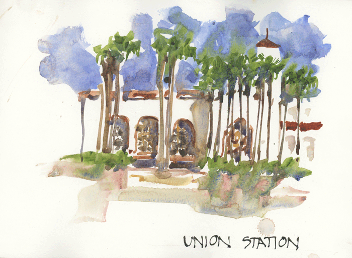
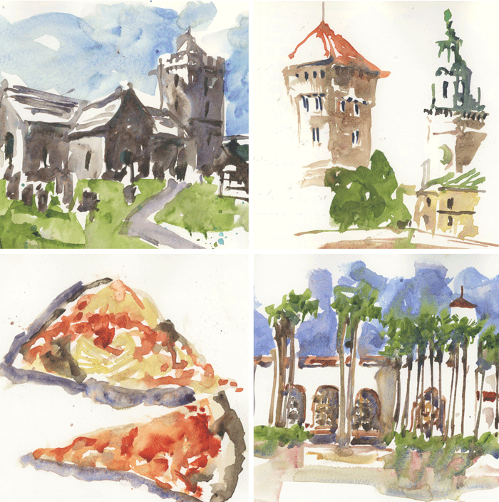
And finally, some more complex scenes with shapes… lots of palm trees joined together with a grand building behind.
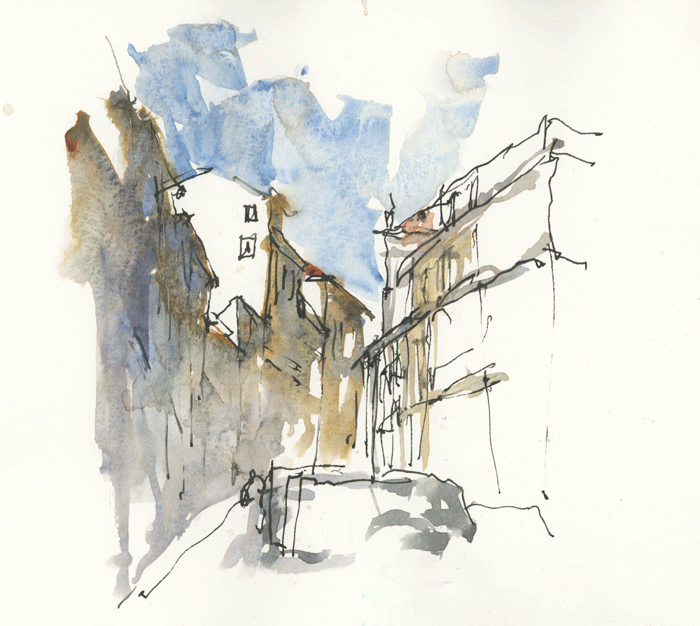
A big shadow shape to describe a very complex street scene in Porto.

More attempts to capture the complexity of the balconies of Porto – the one on the left was too much ‘drawing with my brush’ so I tried another version focusing more on the shadow shapes.
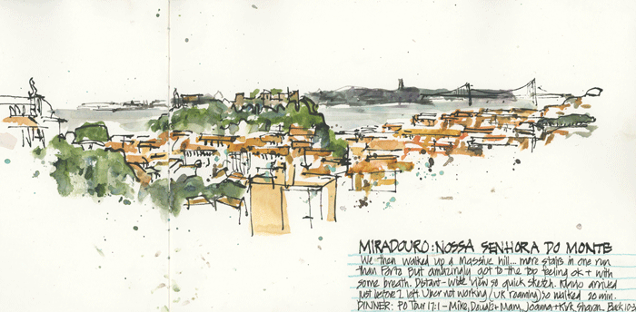
And finally a big panoramic view of Lisbon which I did starting with the shapes of the green areas and the roofs.
As you can see, I get a bit carried away when discussing abstracting shapes. Do you start with shapes in your own sketching?



5 Comments
Liz,
This is such a nice treat for my eyes – how you teach the importance of doing shapes before launching into details.
I tend to like more the shapes with ink lines added subsequently than the shapes only paintings (with color wash).
what are your comments on that point? to me the ink lines added volume and dimensions to the whole painting.
Ditto for the shape painting of human figures.
Hi Ken – sometimes I like the ink lines added and sometimes not… it just depends on my mood and how defined I like the first shapes are
I am new to the Foundations course as of this past month. Your bonus material and extra posts like these has helped me tremendously. I needed to see shapes in a variety of examples before I felt like I was grasping the concept. Thanks!
Hi Katie – so great to hear that you have enjoyed the bonus material. I always have more to share in regard to the core concepts.
I love seeing the comparison between a shaped-based paint only sketch and a traditional ink then wash approach. I am married to ink! I love the look of it, but since starting the abstracting shapes module in your foundations I’ve really been enjoying creating images with just paint. But I still can’t resist adding a bit of ink on top!
NEWSLETTER
Subscribe for first notification of workshop + online classes and more.