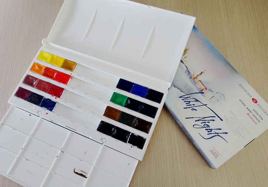
When in Singapore for the Urban Sketchers Symposium in July this year, I was given a 24 full pan set of White Nights watercolours to test. I have heard a lot about these paints so was keen to get a set to test. In essence these paints have a reputation for being highly pigmented very economical ‘extra-fine artist’ watercolour. Note: Most cheap student grade paint have lots of filler and little pigment – meaning that painting with them is normally flat, dull and lifeless.
This is a big plastic palette with a loosely hinged mixing area. The pans are full size and filled to the top – you can see how I have had trouble with them sticking to the mixing area.
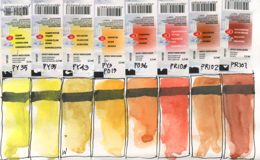
My first step is to do a colour chart and work out what the colours are like and some basic pigment characteristics. Coping a very obvious idea that colour guru Jane Blundell uses, I stuck the labels down and did the swatch underneath. BTW you might be interested in her review – my own testing to date totally agrees with her findings!
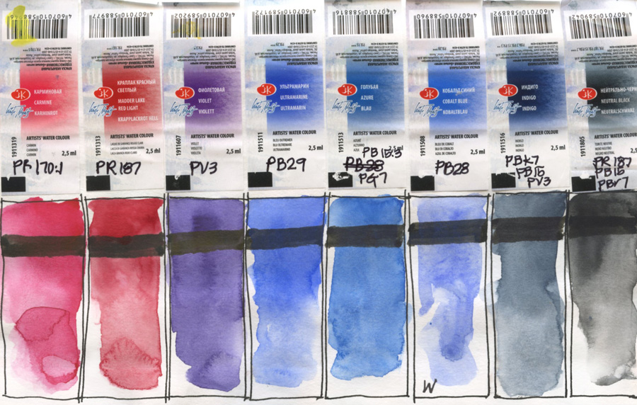
For each swatch I was testing what a general ‘pick up’ of pigment was from a dry pan and then how it reacted when I added more water. I was also testing the opacity of the pigments by painting over a big black ink stroke that I laid down first. What I needed to do as well was to test how intense each pigment could become – I might add this to a small part of each swatch later.
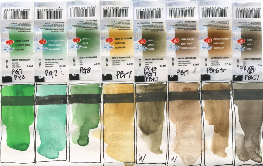
In general I found most of the colours to be strongly pigmented but a few were weak – namely the earths and cobalt blue. In some of these tests I went back to the pan to pick up more paint – so they are weaker than the swatch indicates.
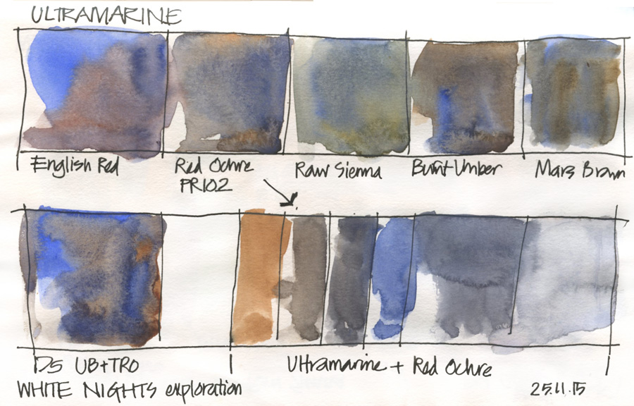
I then did a test of “THE mix” namely burnt sienna and ultramarine and put a swatch of my standard version of this on the page for reference (ie. Daniel Smith Ultramarine Blue and Transparent Red Oxide). I discovered that the orange earth colour of Red Ochre was the closest to what I was used to.
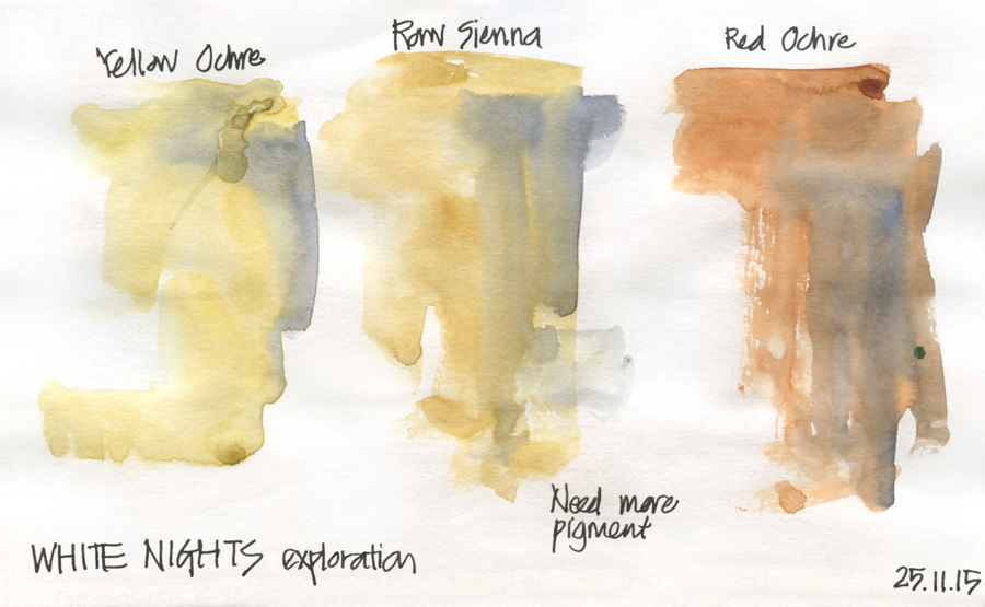
I also did a quick test of some earth colour washes with a quick wet-in-wet wash over the top with my mixed grey from the previous test. I had discovered doing the colour chart that these colours were weak so I wanted to see what would happen in a typical usage. The washes are lighter that I would like – indicating that if I want to achieve the intensity that I am used to, I will have to do more ‘picking-up’ of paint – I will have to work harder to make juicy washes!
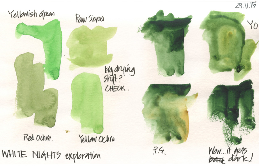
Finally I thought the greens were a little unnatural so I did some tests to see how to mix a more usable colour. This is when I discovered I had omitted to add the full intensity swatches to the earlier colour chart – I was surprised at how dark the Green became.
Ok… now that I have had a little exploration of the paints, I need to test them in a real life painting situation. You can only get so far by doing colour charts but I hope you found this explanation of my approach to initially test paints helpful.
To be continued…
SketchingNow Online Sketching Courses: Foundations Self Directed course start today!


NEWSLETTER
Subscribe for first notification of workshop + online classes and more.