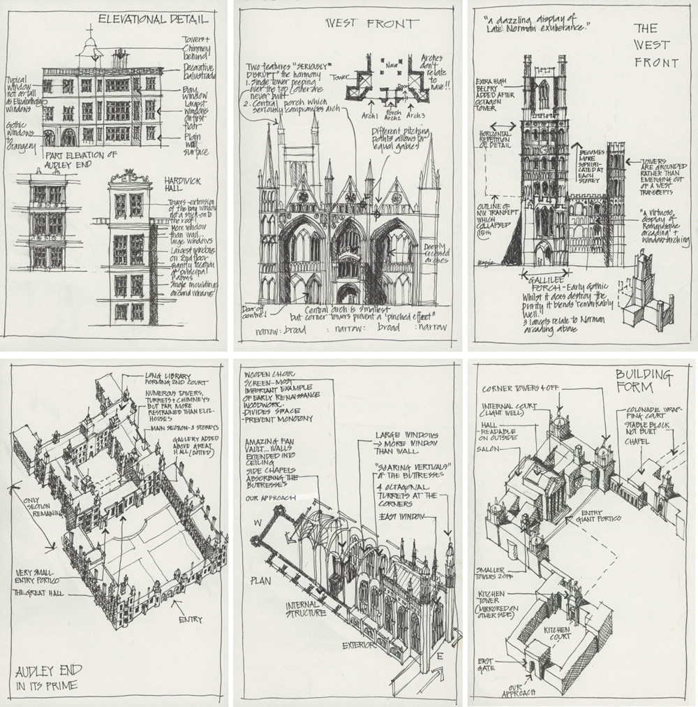
 Last week my great sketching buddies Suhita Shirodkar and Paul Wang invited me to be a guest at one of their SketchingPlayLab Block Parties. It was so much fun!
The theme of the Block Party was travel sketching and I gave a short presentation about my approach to it. I explained three important aspects of my travel sketching which stems from early work – decades ago. These were:
- My love of storytelling (particularly of my silly adventures) during my teenage years using words, little sketches and maps. See this article for some travel sketches done when I was 19!
- My desire to sketch with the same flow I had while ‘design sketching’ as part of my job as an architect. See a little about this here.
- My personal hobby (and mind obsession) of studying architectural history and theory. At the time I felt this was a rather obscure interest for a contemporary Australian architect to have. My university education was focused more on modern architecture and when I graduated I certainly didn’t have an appreciation for old buildings. This interest in architectural history was started by thoughts of traveling to Europe one day.
Back in 2000, I traveled through the UK for the first time with my sister, and part of my preparation for that trip was to do a LOT of research on the history of architecture in England. I didn’t want to go until I was able to recognise all the different periods of English Gothic – talk about setting high standards for myself! And I was also very interested in the influence of Palladio on English architecture. Yes, I’ve been a Palladian fan-girl for decades!
I wanted to sketch while I was travelling but I only managed to do a few pages. So instead I spent nearly a year after returning home researching all the buildings we visited and then summarising my findings in a number of drawings. Doing notated drawings was the best way I knew to record my discoveries! I also remember that at the time I wanted to improve my freehand drawings for work and I thought this would be a good way to do that.
I filled two A5 cartridge sketchbooks with the drawings of floor plans, elevations (straight-on views) and sections (cutaway views). I also did a number of axonometric drawings!
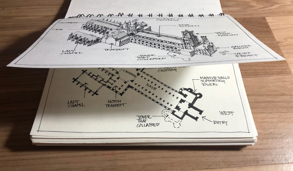
An axonometric is a 3 dimensional drawing which is created by rotating a plan and then projecting the heights vertically. They result in a funny looking aerial view, so they are more diagramatic than realistic. But the really cool thing about them is that they accurately describe the plan and the form of a building. I did an axonometric view of all the cathedrals I visited and some of the great houses as well. It was a good challenge! To make it easier for myself, I drew the floor plans at an angle so that I could use it as a base for the axonometric on a page over the top.
I have shared some of these ‘UK2K’ sketches before here and here. But I thought that it was time to scan and share a few more.
Blenheim Palace
I’m a big fan of the work of Sir John Vanbrugh and Nicholas Hawksmoor and absolutely love Blenheim Palace. BTW I also did a lot of drawings for Castle Howard (also by Vanbrugh and Hawksmoor) which you can see here.
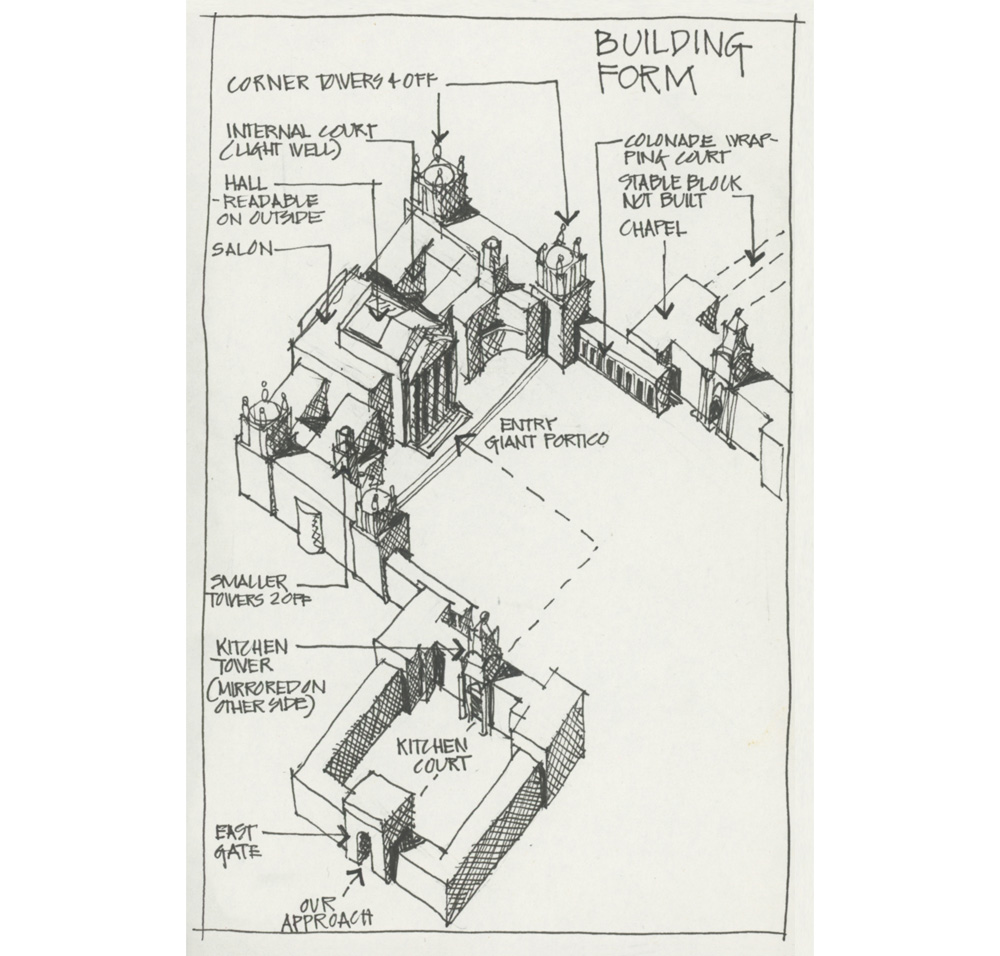
Here is an axonometric of the whole palace showing the main volumes.
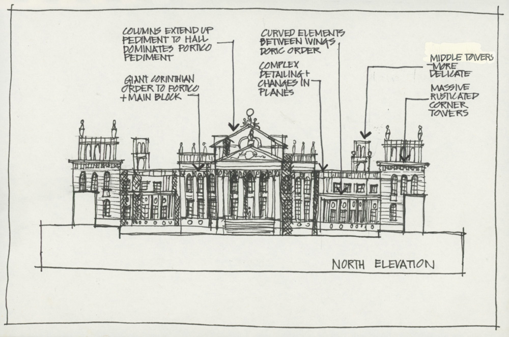
Elevation of the front facade. I drew four different elevations like this one!
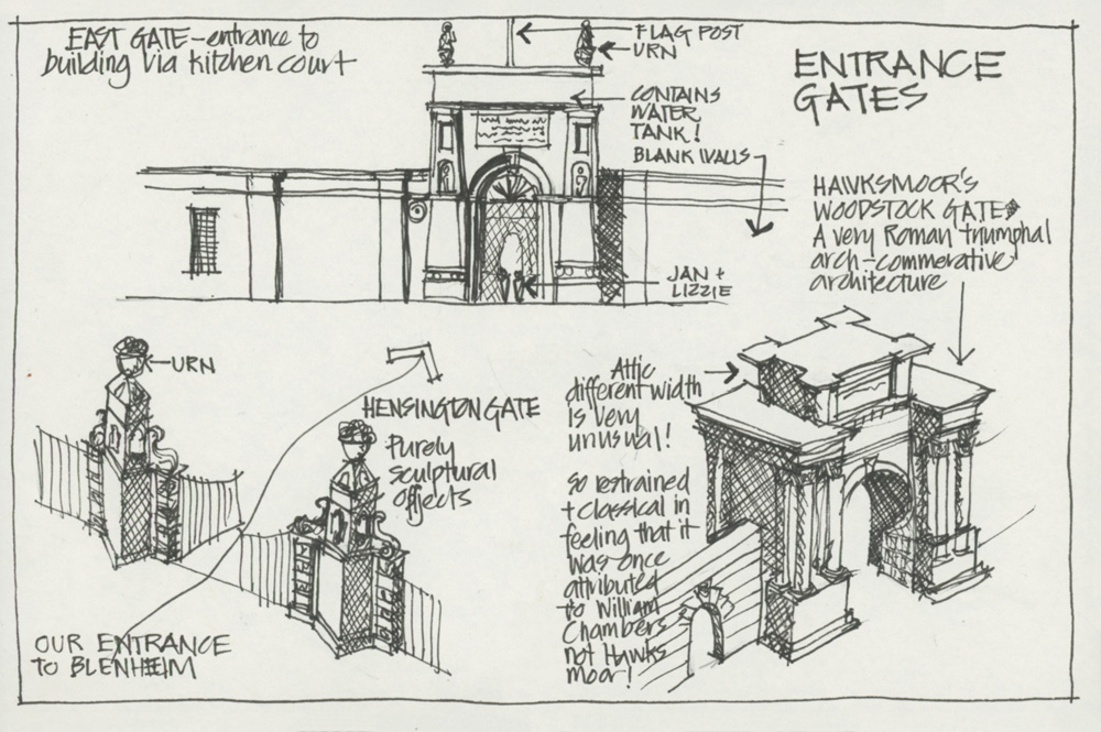
Lots of fun designs in the various entrance gates as well!
Cathedrals
Back in 2000 I was really interested in English Gothic architecture and went to a lot of different cathedrals during the trip. In fact we visited 4 cathedral towns in one day. Here are a few of many sketches I did of them.
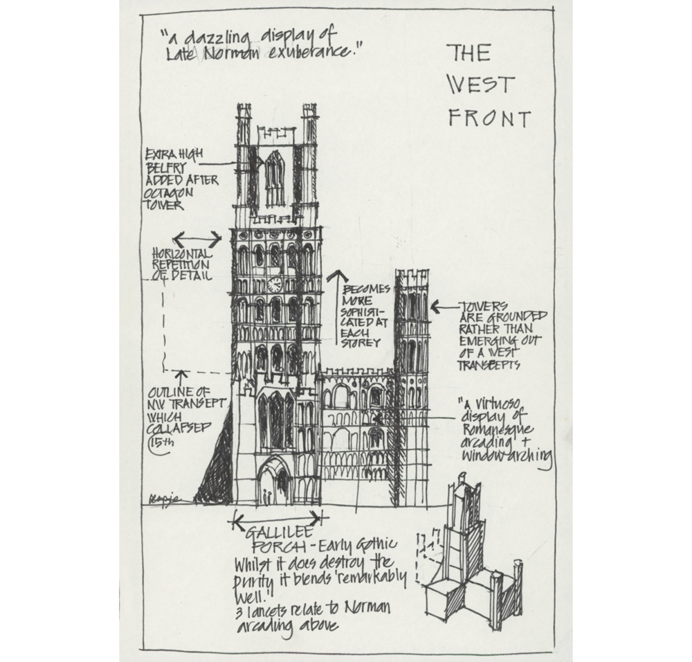
Ely Cathedral. This drawing is very important as it shows the foundation of my current approach to sketching buildings – looking for the base volumes and drawing the structure first.
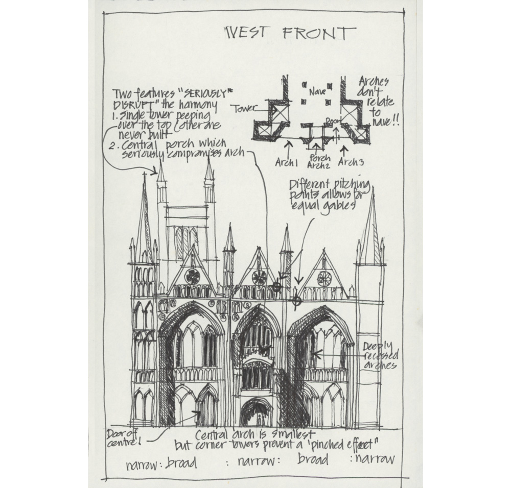
Peterborough Cathedral – delightfully quirky. I would love to return and sketch it again.
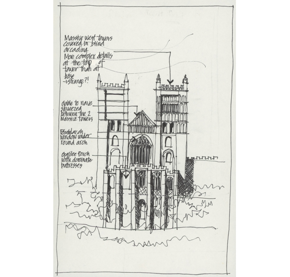
Elevation of Durham Cathedral – using the same technique of not drawing everything!
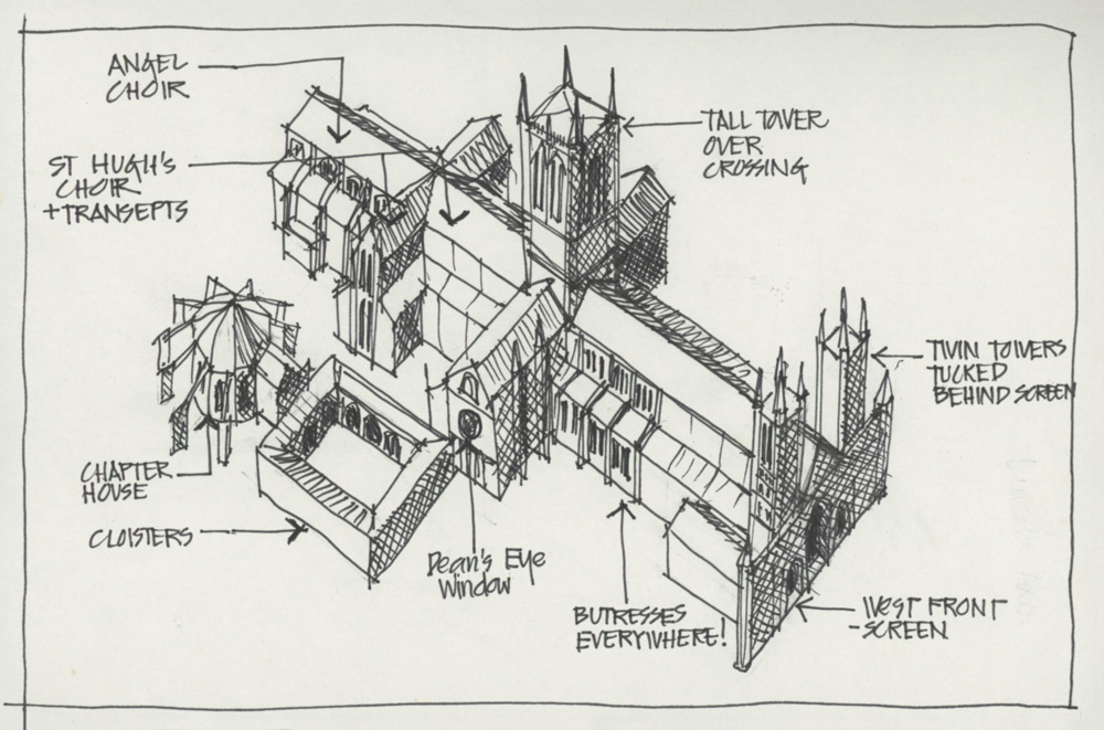
Axonometric of Lincoln cathedral (perhaps my favourite English cathedral… even though the facade is a bit flat, the setting is stunning and without doubt the interior is gorgeous!)
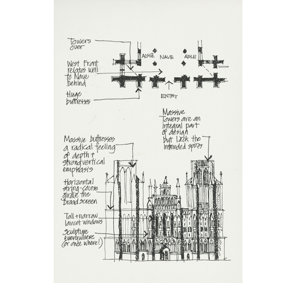
Wells Cathedral – once again a common theme was how the front facade relates to the plan of the building behind.
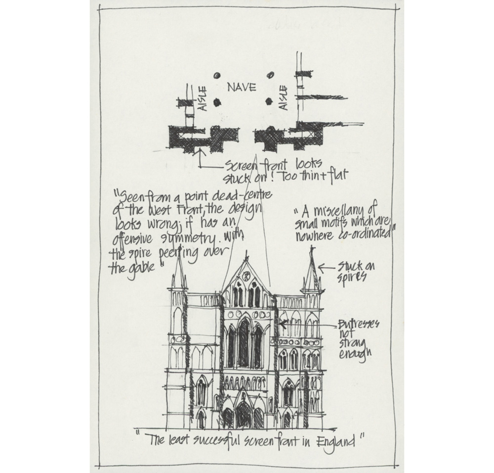
The elevation of Salisbury Cathedral. One of the books I used for my research was The Cathedrals of England by Alec Clifton-Taylor. It’s a fantastic book with delightfully strong opinions which I loved quoting!
Cambridge
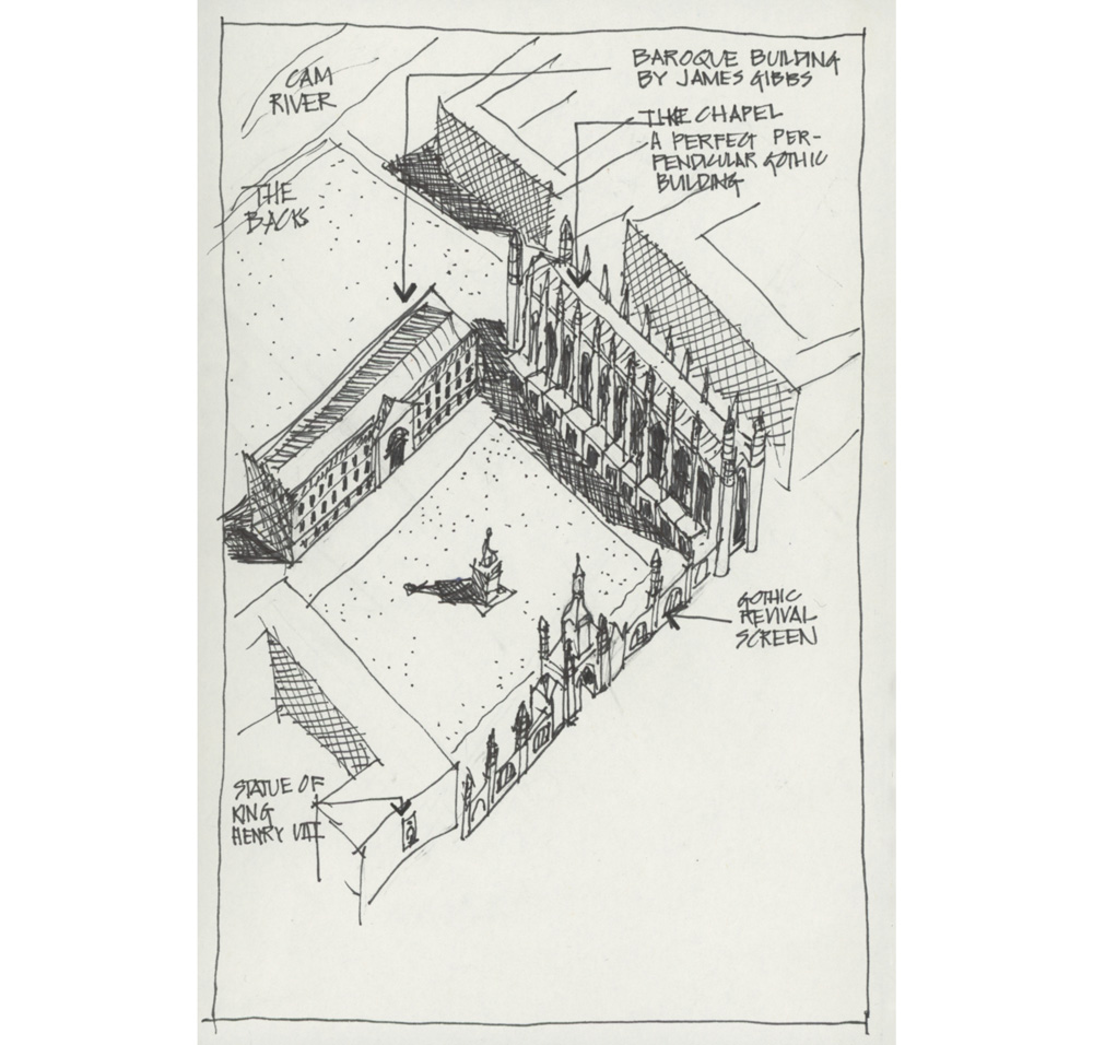
An axonometric showing King’s College Chapel in context.
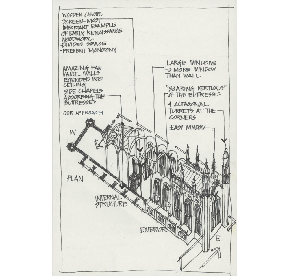 An ambitious axonometric of King’s College Chapel itself showing plan, internal structure and exterior. Wow! I love this building.
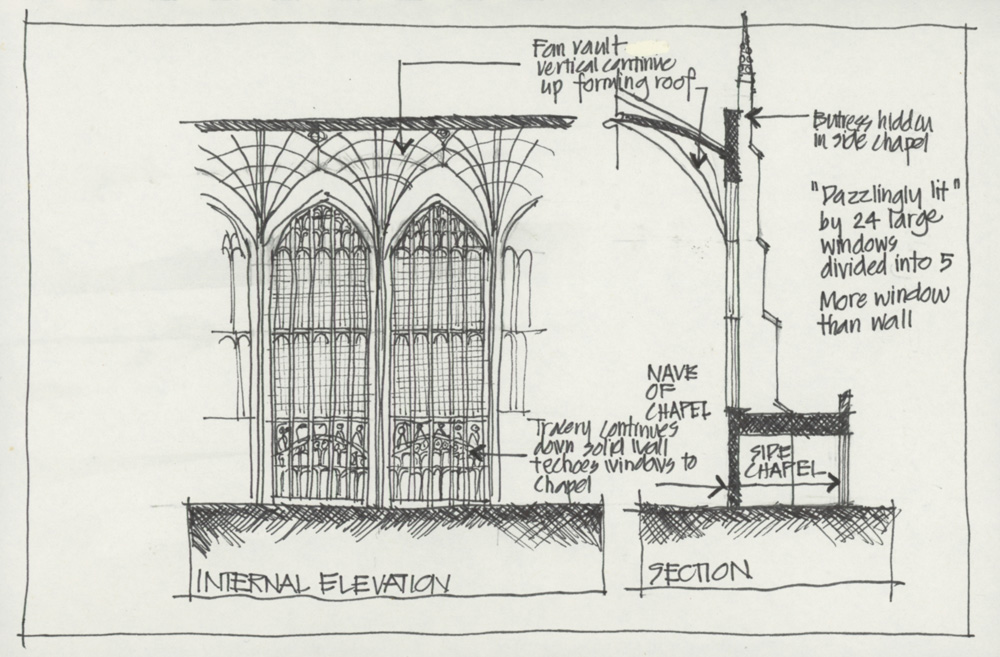 A section and interior elevation
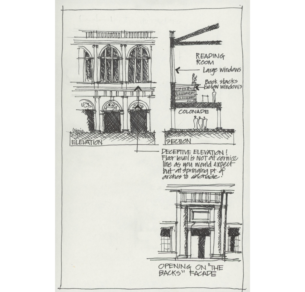
Another section and interior elevation
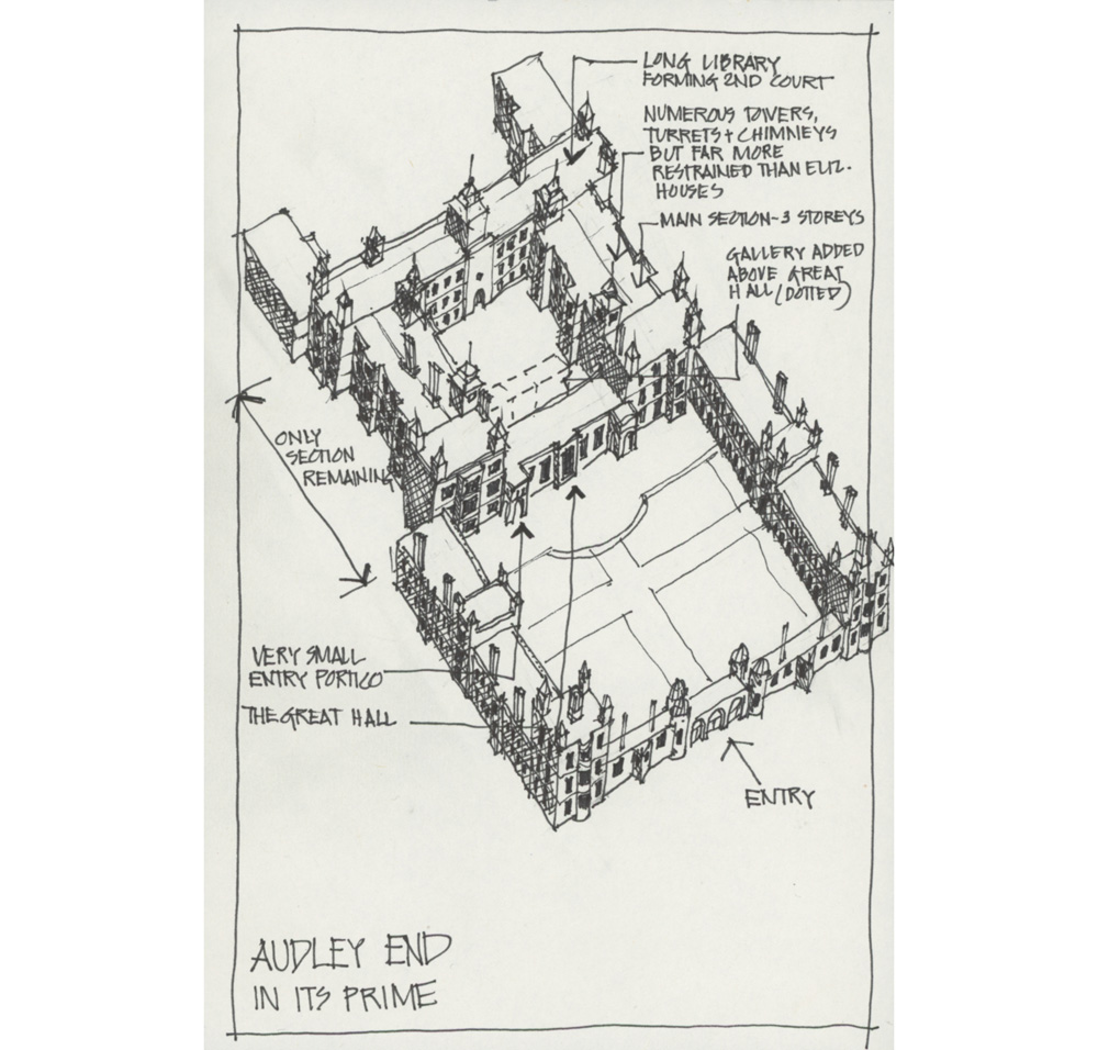
Audley End
Another great house and fun overall axonometric!
Comparison of a few Elizabethan palaces. Little did I think at the time that I would sketch Hardwick Hall on location 10 years later.
It’s really fun to look at these sketches again – both in terms of the content and the technique. I did them all with a 0.4 Artline fineliner and so there is no variety in line weight. I also didn’t know much about cross-hatching back then. So these are two aspects which would be different if I were to do something similar these days. I can still do neat but I rarely feel like it.
Yes! I can do neat when I’m in the mood. In fact, I did a number of accurate and detailed sketches during this years Group Run-through of my Buildings course which you can see here. And a number of years ago, I did a neat sketch of Chiswick House and commented that the biggest part of the process was drawing some small details carefully even though they were not the most important part of the whole building. I like to focus on the most interesting part of the design of a building and this rarely involves recording all the details.
I know that detailed drawings always look impressive but for me they are a little tame. It does take skill to be able to balance details, line weights and hatching etc but I know that if I simply slow down and take each step carefully I can fairly easily produce this style of drawing. But working quickly and loosely, direct with watercolour while still achieving a degree of accuracy is much harder! It also has a greater degree of risk-taking and discovery.
My current style architecture sketches (a lot of direct watercolour) is very dependent on this type of architectural study and detailed work but I no longer feel the need to draw this way. Instead I want to capture the essence of a building with minimal strokes so that the end result tells more of a personal story – what I think of the building. My epic day in Venice from 2019 is an example of this.
There is a lot more I could write about the importance of these drawings, but I’ll leave it for another article. And just for the record, these are only a few examples… I still have some more drawings of important architecture in London to share!
I’m really happy to have had a prompt to revisit some of my early work. So thanks again to Paul and Suhita! It was great to hang out with you as part of your SketchingPlayLab sessions. I have done a few private sessions with them doing some SketchingPlayLab exercises and highly recommend them. Find out more here.





4 Comments
What an interesting post! I love all these detailed drawing (and the snarky (not yours) comments. So much more skill must be required to net it all out in a few lines and some watercolor! Personally, my favorite part of all your travel sketchbooks is your wardrobe! The clothing has such life.
I can’t tell you how much I love this post and the ones Liz links to! Even though it’s about another subject area, it EXACTLY describes my experience and hopes for my nature journaling. This, for example: “Doing notated drawings was the best way I knew to record my discoveries!” And from an older post: “The PRODUCT is not the sketch itself but the design idea that the sketches, or the act of sketching reveals. … There is a dialogue between hand and brain that is not sometimes visible in the sketch–and it is this wonderful ACT OF DISCOVERY in the design process which comes through sketching that I LOVE THE MOST.” Replace “design” with “nature study” and this exactly speaks to my experience. (These are also ideas emphasized by nature journal artist John Muir Laws.) I am frustrated by my clumsy technique often (which is why I’m taking Liz’s Foundations course!) but I never regret the process of sketching. I always learn something unexpected about the world. Thank you for this post!
Hi Liz, thoroughly enjoyed this post! Your youthful sketching journal was a hoot. And i took particular note to enjoy the journey of discovery and not seek the perfect result. Wise words indeed. Thank you so much.
Axonometrics must be in the star this week as I was going through boxes and came across my architectural portfolio. I used to do them regularly to let clients understand how their building would look and work. In fact, a huge part of why I left architecture was the switch to computer drawings — while it was lovely not to have to draw the base plan of a high rise 20 times for 20 floors, I saw a drop in creativity from not sketching and drawing, and a personal pleasure went out of the profession for me. AND, I much prefer the sketched drawings to the fine line drawings of past, though I loved doing them. Getting lost in many many lines thrilled me.
NEWSLETTER
Subscribe for first notification of workshop + online classes and more.