Last Thursday and Friday I held a 2 day sketching architecture workshop. I have done a number of one day workshops in the past (in Melbourne, Sydney and Newcastle) and in November 2013 I ran a 4 week course, but this was the first ‘2 dayer’ that I have taught. A lot of the content is similar but it was great to have two consecutive days to develop the ideas and to put my approach together in a more systematic way. It was also a good chance to test out my ‘pointless perspective’ ideas that I will be teaching at the Urban Sketchers Symposium in July.
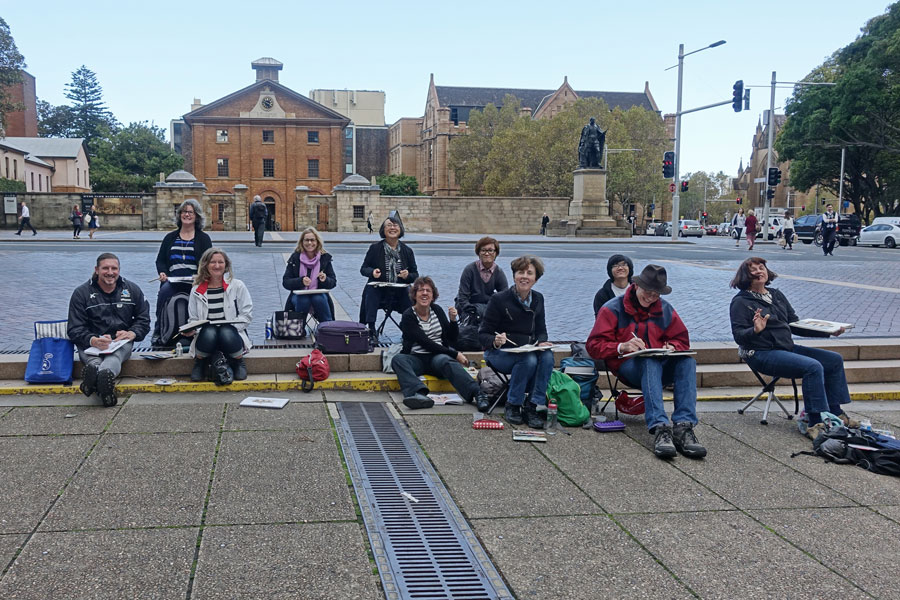
I had a great group doing the workshop and the work produced by everyone was outstanding! Here they are (less one person who had to leave early) happily sketching during the afternoon of the first day.
I had four concepts that I shared over the 2 days which particularly focused on drawing the 3-dimensional form of buildings. The concepts are:
1. Constructing Volumes
2. Structured working method
3. Understanding perspective (but not doing a lot of elaborate setup lines)
4. Mapping light and dark (and working with shapes)
Day 1
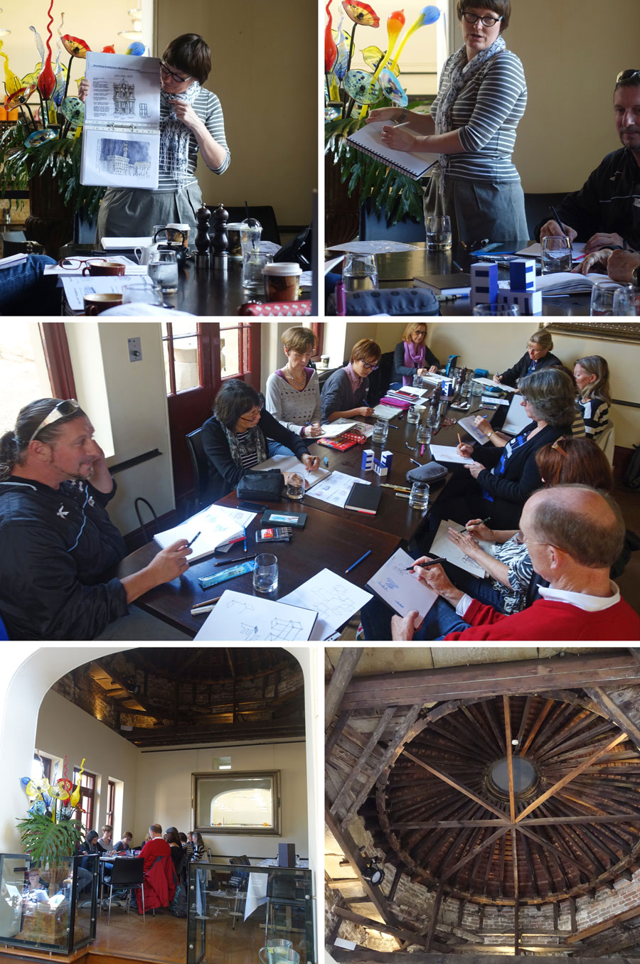
We started both mornings in the lovely mezzanine area of the Hyde Park Barracks cafe (with a historic timber dome overhead) and after my usual introduction (my background and love of architectural history, theory and design etc) we got started on some line exercises and then drawing a collection of boxes with specially designed outer skins. We drew these boxes ‘feeling edges, abstracting shapes and thirdly by constructing volumes’. A lot of people think that you must use perspective in order to draw buildings so these exercises were all about proving that there other options – however they are dependent on working slowing and having very sharp eye-hand coordination. Those in the class, and those of you reading, who have done my online Foundations class, understand what I am getting at with these exercises! I just keep coming back to these three ways of visual thinking with everything I do – read more about them here.
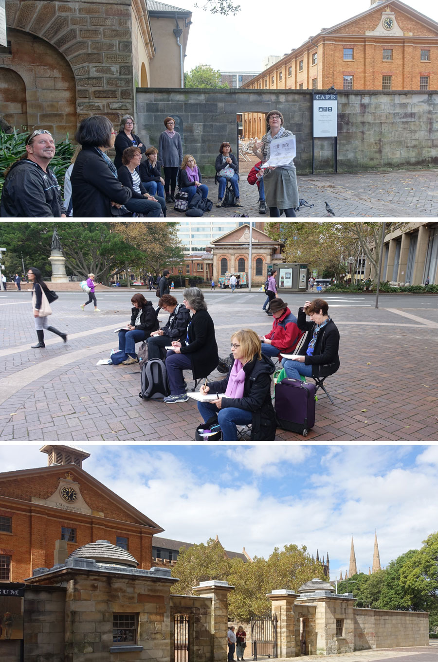
We headed outside to a glorious autumn day (even more appreciated after the horrendous wild destructive weather we had had on the previous three days) to start doing some quick ‘constructing volumes’ exercises. Working with watercolour pencil first, the goal was to draw the main volume of the building and then add or subtract elements.
No perspective setout was allowed as that would distract from the main objective to feel the forms, the depths and thicknesses. Most people choose the little domed gatehouse to the Hyde Park Barracks – but a few tackled the Barracks building which was far more challenging.
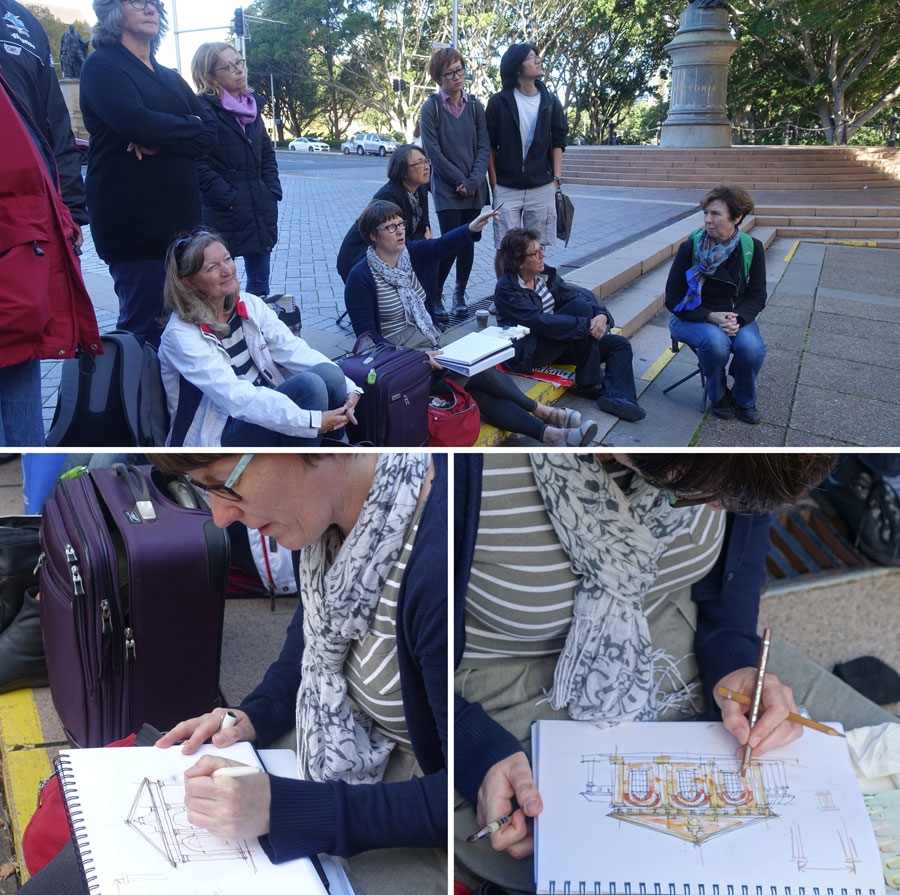
After lunch I did a full demo of the facade of St James Church which is directly opposite the Barracks and is also designed by Francis Greenway. We were looking at my ‘Structured Working Method’ – how to take the time to study and explore the structure and proportions of a building first and then to work in a measured way from the overall shapes and divisions down to the details.
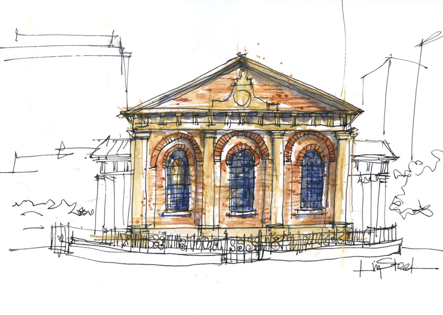
Sitting straight on to a building is a great way to understand these ideas. It might not be the most exciting view to sketch, but unless you understand how to draw something front on with a certain confidence, drawing obliquely will be a lot harder.
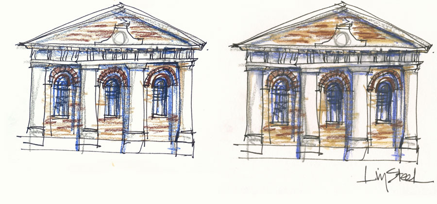
I did a second demonstration with watercolour pencils and no guidelines – ie. I wasn’t trying to achieve perfect proportions or even straight lines. Here is the sketch in the ‘dry’ state and then after I had touched it lightly with a damp waterbrush.
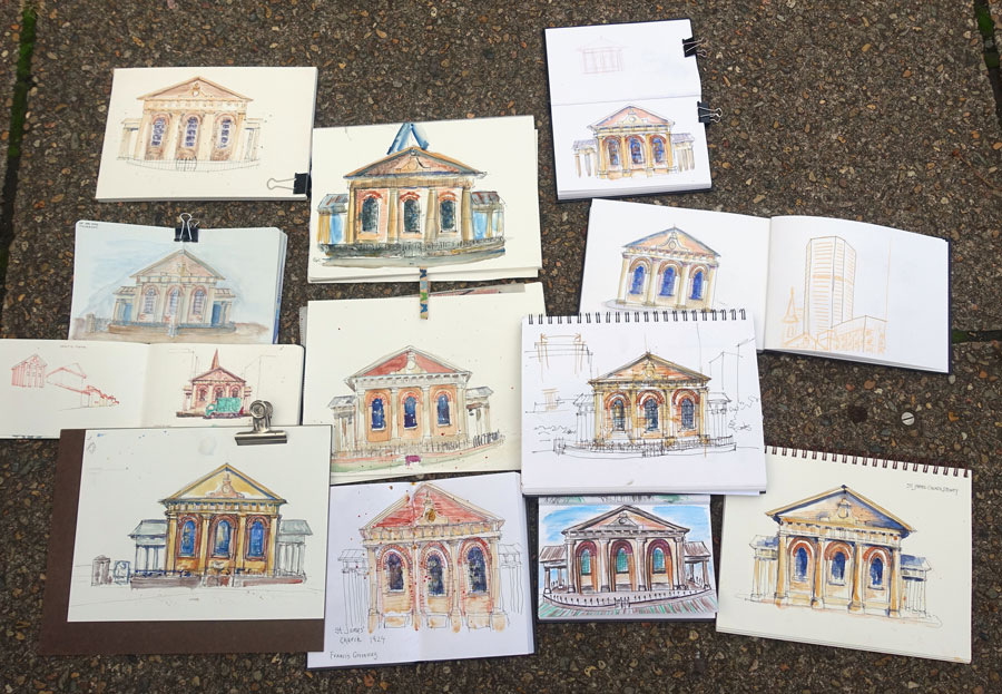
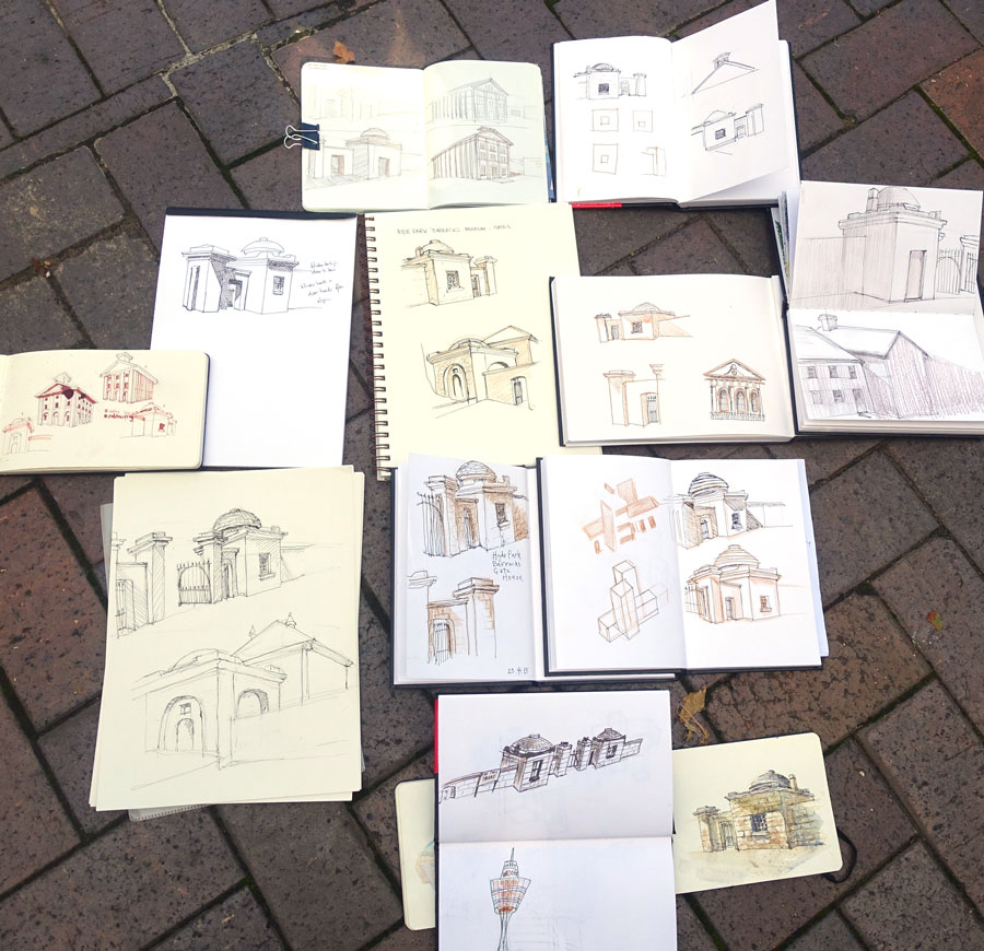
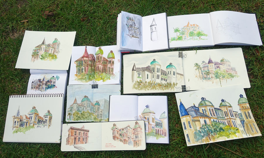
And here is the collection of work done. Look at all those gorgeous sketches!
Day 2
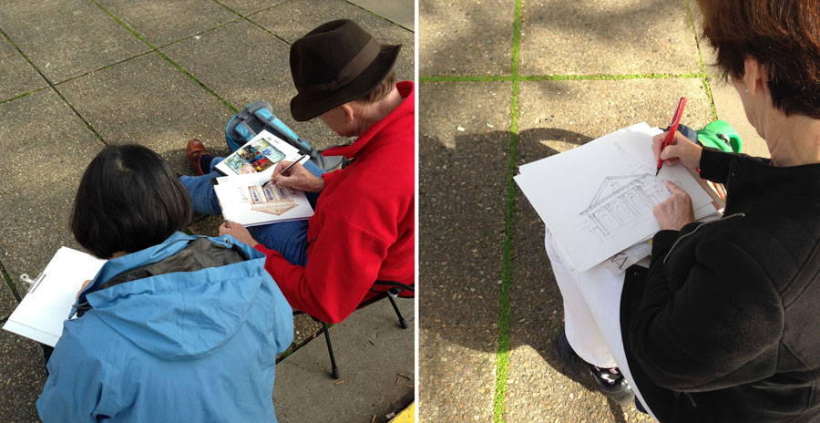
How totally cool to turn up for Day 2 and to see a few people sitting outside having another go at St James… that was a very inspiring way to start the day!

Morning Session: It was time to tackle perspective and once again we had an indoor ‘theory’ session before going out on location.
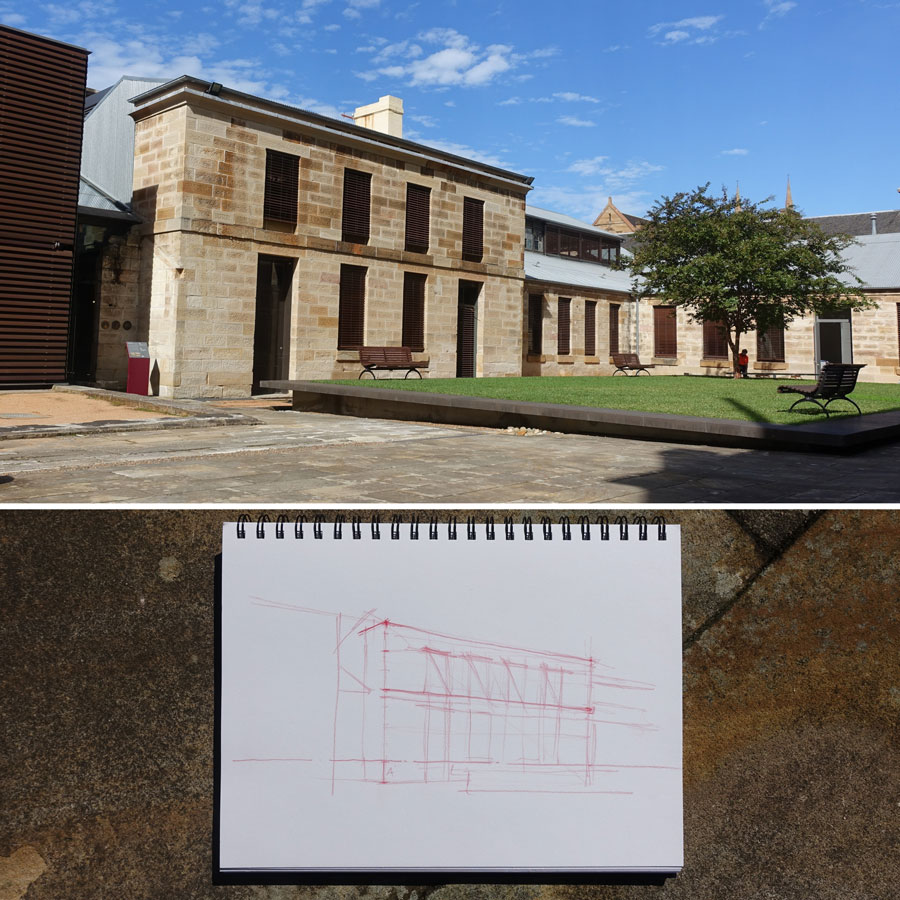
Last week I discovered the lovely courtyard of The Mint which had this great section perfect for a basic perspective exercise (some of the more experienced members of the group found something more challenging in the area to sketch!). I did a partial demo showing my perspective setup – and notice not a vanishing point in sight! This is why I call my approach ‘pointless perspective’ – I am not going into my tips and tricks in this blog post but it was great to put my ideas to test with the group last week and work out a few refinements that I want to make. I realize that although I rarely use a vanishing point on my page, there is a LOT of stuff I do intuitively that is the result of a working knowledge perspective laws. I do believe it is important to understand a few of these, but I don’t believe that technical setup or the traditional explanation of perspective is always applicable when sketching out on location.
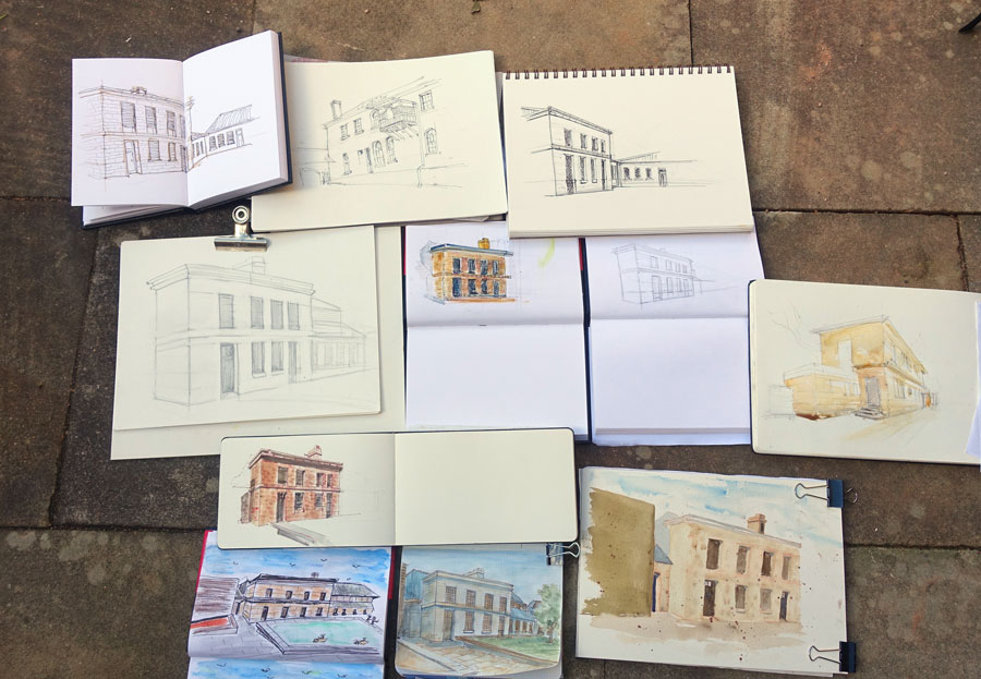
How amazing is this collection of sketches done by the group after a morning session? I was blown away… but of course, the real test is to see whether the group will be able to put these ideas into practice in their own work over the coming weeks and months. Many people understand perspective basics, but how to apply it when out on location is the big question. How do you get accurate angles for your lines, do you really need to do all those setup lines and how do you do it when the vanishing point is off the page? These issues are what I am most interested in, and can’t wait for the USK Symposium to teach my ideas again!
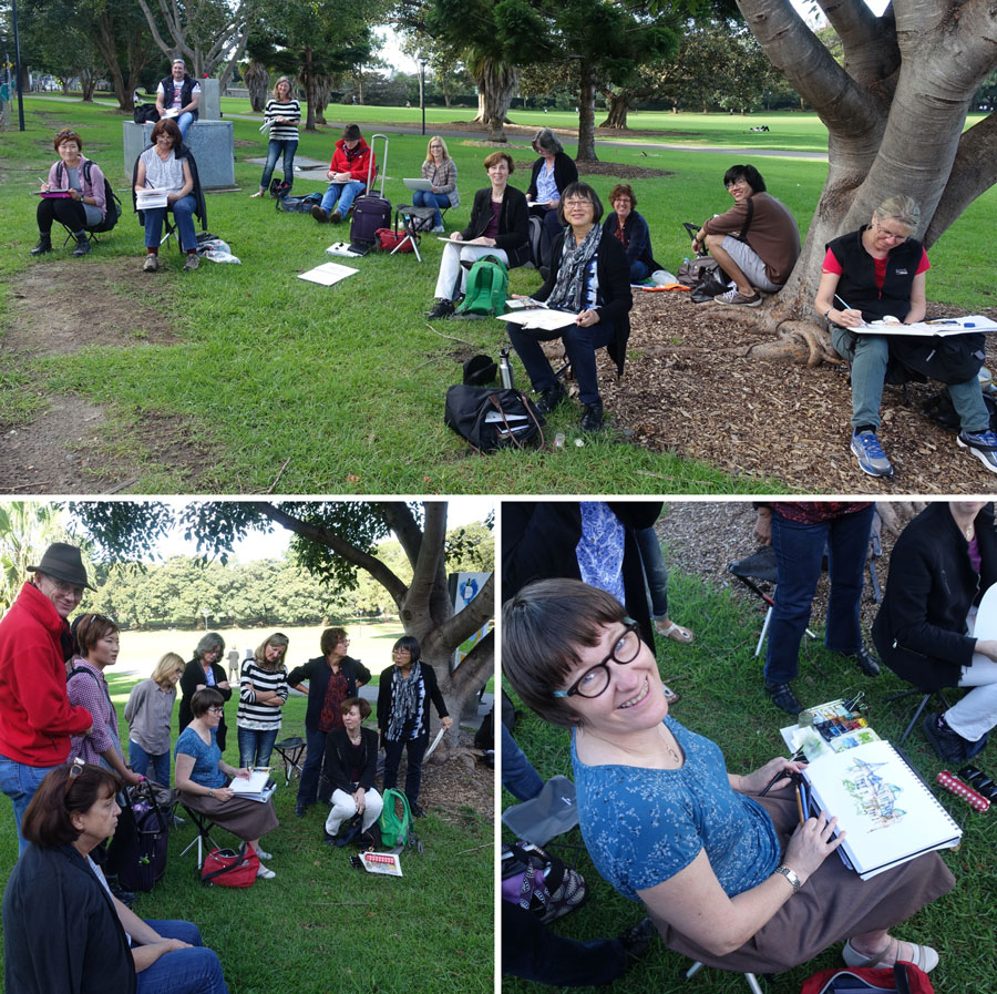
After such an intensive morning, the last afternoon was a lot easier. The goal was to explore drawing architecture by shapes and in particular the importance of having a good sense of light and dark to make the 3D form of buildings look solid. It was a cloudy afternoon and no direct sun in the area I had chosen, but we still looked at shapes and how to create a sense of light and dark even when the lighting is flat.
I did a demo that was paint first and then a little watercolour pencil to define the edges.
A lot of people found it fun to paint the shapes first but were then reminded that we needed to think about adding and subtracting volumes and depths and thicknesses (as we had looked in the first morning session) otherwise our sketches would look like cardboard boxes rather than real buildings.

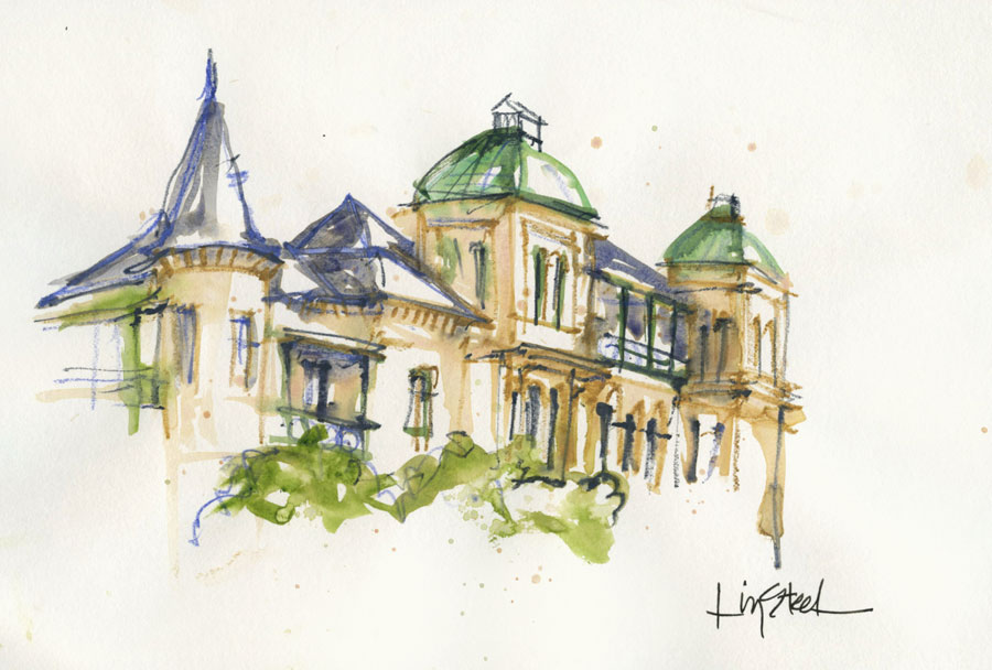
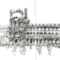
I did another quick sketch while they were all working away – one of my ink line sketches.
What a fantastic two days and a great group! Thanks to everyone that was a part and made it a special two days for me as the teacher. And special thanks to Chris and Chris for taking photos during the workshop for me so that I can share with you all now!
First news of all future workshops will be via my monthly newsletter. If you haven’t already, please subscribe in the form below!
Subscribe to my mailing list for my monthly newsletters including first notification of my new SketchingNow Online Sketching Courses and face-to-face workshops.


8 Comments
It looks a fabulous group indeed, Liz. The ponytailed guy is a hottie! Anyway, love seeing everyone's sketches and your points on perspective. Interesting approach!
Thank you Liz. It was a wonderful workshop and I learnt a great deal. Your 'pointless perspective' is not pointless but very useful! Buildings will never be the same again!
Wow! Looks like great FUN! Makes me miss "Foundations" SKN course all the more!!
I am continuing to love your ink sketches…..I love the colour too of course!
Thanks for sharing Liz!
Tony in Montreal
Thanks For Sharing that............
thanks Sherry- it was a great group with lots of wonderful work done!
So great to have you in the workshop Dotty!I hope my pointless approach helps….
thanks Tony … I miss my online class too… but still need a little time for the next one!
Thanks for your comment about my ink sketches- I am still loving doing them a lot!
my pleasure!
NEWSLETTER
Subscribe for first notification of workshop + online classes and more.