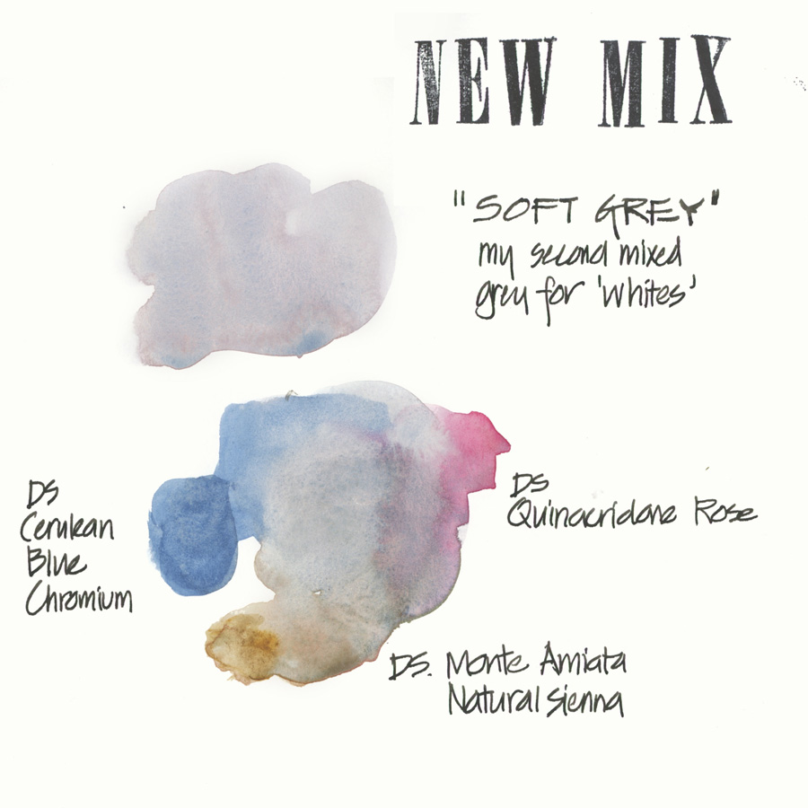
I know that some of you have been patiently waiting to hear what my new grey colour is. Well, I am finally ready to reveal it!
I refer to it as “Soft Grey” and it is mixed from mostly Cerulean Blue Chromium, a little Monte Amiata Natural Sienna and a touch of Quinacridone Rose. Note: all are from the Daniel Smith range.
2018 UPDATE: I am now using Hansa Yellow Medium in this mix rather than Monte Amiata Natural Sienna
I am using this mix a lot for muted colours and shaded areas to white, so it is really convenient to have it pre-mixed into a full pan. I am totally indebted to Jane Blundell (and her Jane’s Grey) for the idea of pre-mixing colours.
As for how I mix up pre-mix colours… it is very unscientific. After getting a rough feel for the best proportions of each paint colour, I just squeeze a little bit of each into an empty pan and mix it with a toothpick. Each mix is a little different but I don’t mind that.
I also know that I am due (overdue) to do a palette update, so hope to be able to share that next week.
So what’s your current favourite mix in your palette?



8 Comments
Only yesterday I mixed up Ultramarine Blue & Burnt Sienna as i was tired of messing up the mixing area on my palette. I have a nice gray that I can turn cooler or warmer with the slight addition of either color also in my palette. Moonglow is an interesting color. I am going to experiment with it. I will also experiment with your mix. What I am looking for is a good gray for people with gray hair. We have a high population of seniors who visit the local coffee shop where I sketch. Thank you for sharing your mix.
Hi Carmel – give this mix a go for your gray hair! UB & BS is a winning combination. Moonglow is a popular colour but I prefer my own cleaner, bluer purple shadow colour.
If you want a really dark grey mix indigo and burnt umber are great. I have a pan of grey mix in my palette of ultramarine and burnt umber which can be warmed up with burnt sienna or cooled down with a touch of indigo. If you don’t mix these too thoroughly you can get some lovely granulation and unexpected “happy accidents”.
I’m so glad you mentioned granulation! It is said that overmixing watercolor is like overmixing biscuits or muffins, a definite no-no. They say it makes a dull, flat color. I am glad to see you have had success in granulation, which is so beautiful, I will be careful not to overmix.
Meant to say I love your soft grey and I think with a tad (technical term 😉 more of the natural sienna will make just the right base colour for the traditional stone buildings of my area of the Cotswold Hills in England.
This is a gorgeous gray! I also like Cerulean Blue Chromium and Potters Pink. It’s not as quite as neutral, but is very pale and granulating i (I prefer Winsor Newton Potters Pink over Daniel Smith. The latter seemed gummy to me.).
Oh greys, I always say to myself to have some premixed one, but then I have so many grey mixes I like! I will try your new grey in my next sketches though, really lovely. Lately I have grow fond of Cerulean (Rembrandt) with Schmincke’s Translucent Orage for a nifty grey for skies. And I find myself using more and more Pyrrole Red PR254 with Pthalo Green. Or ocasionally mixing my own moonglow on the spot with Indian Red, French Ultramarine and a touch of my beloved Perlyene Green. Such an awesome color this last one, it both serves as a black, as a green and as a perfect colour to neuter reds.
I love this delicate, subtle soft gray. Thanks for sharing it, Liz! I also mixed Sebastian’s gray and both of Denise’s and like them all too. Maggie, I also enjoy the CBC + PP mix, and agree about using W&N. My chart of gray mixes is getting bigger and more exciting all the time! Most of these mixes have granulation–so beautiful!
NEWSLETTER
Subscribe for first notification of workshop + online classes and more.